
How to Get a Filmic Look in Your Images
Edited with the Velvia Profile from Film Edition 3 Colour
There is a certain kind of edit people often describe as filmic.
Usually, what they mean is that the photograph feels a little less clinical. Less digital. A bit more atmospheric, perhaps. The tones sit more gently. The colour feels considered. The image has a mood.
That said, “filmic” can mean different things to different people. It is not just grain. It is not just fading the blacks. And it definitely is not a case of throwing a preset on everything and hoping for the best.
In this post, I want to break down what actually gives an image that filmic feel, why certain looks suit certain photographs, and how you can start building that look in Lightroom.
I’ll be using examples edited with my own Lightroom Presets because that is genuinely how I work. But there’s plenty here for photographers using native Lightroom, too.
Key takeaways
Filmic is not one look: it is usually a mix of tone, colour restraint, texture and mood.
Start with the light and subject: the edit should support what is already in the frame.
Do the heavy lifting with tone first: grain and finishing touches should come later, not first.
Native Lightroom can do this perfectly well: presets simply make the process faster and more repeatable.
Not every image wants a filmic treatment: sometimes the best edit is a more modern look.
What actually makes an image look filmic?
For me, a filmic look usually comes from a few things working together.
It starts with tone. Highlights tend to roll off a little more gently. Blacks often have depth, don’t always need harshness. Contrast should be there, but it should feel shaped rather than aggressive.
Then there is colour. Filmic edits usually have a more controlled palette. Not flat, not dead, just less shouty.
Skin tones matter. So do greens. So do blues. If every colour in the frame is screaming for attention via vibrancy, the image can start to feel digital very quickly.
Texture matters too. Grain can help, yes, but only when the rest of the edit is already working well. Grain on its own does not make something feel like film any more than putting scratches on a new table makes it antique.
And perhaps the biggest thing of all is suitability. A filmic look works best when it suits the light, the moment or the subject.
A quick way to think about it
| Element | What usually helps | What usually hurts |
|---|---|---|
| Tone | Gentle highlight roll-off, shaped blacks, and contrast that feels controlled rather than forced | Blown highlights, crushed shadows, and hard contrast that makes everything feel brittle |
| Colour | Restrained saturation, believable skin tones, and a palette that feels cohesive | Overcooked colour, neon greens, orange skin, and every colour competing for attention |
| Texture | Subtle grain, natural detail, and a slight softness where it suits the file | Too much sharpening, too much clarity, and fake grit that looks added rather than earned |
| White balance | Using white balance for mood as well as accuracy, keeping some of the atmosphere of the original light | Flattening the mood by neutralising everything until the image feels cold or lifeless |
| Overall feel | An edit that supports the subject, light, and mood already in the frame | Forcing the same treatment onto every image whether it suits it or not |
A filmic look starts long before the grain slider
This is probably the bit I feel strongest about.
People often jump straight to grain, faded blacks, or some kind of cheap vintage preset. But if the underlying tonal work is wrong, the image still won’t feel right. It will just look processed.
The real work happens earlier in the edit process.
You are deciding how bright the frame should feel.
How much contrast does it want?
Whether the white balance should lean into warmth or hold back.
Whether the colours need to be cleaned up or muted slightly.
Whether the shadows should feel rich and deep or open and airy.
That is where the character of the finished look comes from.
Grain, softness, and finishing touches sit atop that.
Can you get a filmic look in native Lightroom?
Yes. Absolutely.
You do not always need presets to do this. Lightroom already gives you the tools. What good presets, like mine, do is speed things up and make good decisions repeatable.
A simple native Lightroom approach might look like this:
Start with the profile or camera starting point that feels closest.
Set white balance for mood.
Shape the tone curve or basic sliders so highlights feel softer, and blacks feel deliberate.
Pull back any colours that are pulling too much attention.
Be careful with clarity and sharpening.
Add grain near the end, not at the beginning.
Use local adjustments to guide the eye rather than forcing the whole frame.
Those are the main steps.
With my own presets, I’ve built that process layer by layer.
There are base-level LUT profiles that establish character, prebuilt filmic look presets for a strong starting point, and a full set of Utilities for fine-tuning things like tone and grain afterwards, so the workflow is much faster.
Shown here: this edit begins with my Film Edition 5 Monochrome Monochromatic Film (Neutral) profile, then uses the Grain - True Film utility to add texture and help shape a more natural filmic finish.
Example one: soft light, soft contrast, quieter colour

Film Edition 3 Colour - Cinematic Film preset in one click, with nothing else adjusted.
This sort of image is usually where a gentler filmic treatment really shines.
If the original photograph already has soft light, perhaps from a window or open shade, I don’t want to ruin that by forcing contrast. That would fight the image. Instead, I’d usually keep the highlight roll-off gentle, let the midtones stay rich, and avoid oversaturating the frame.
The reason this kind of treatment works is that it supports the existing atmosphere.
In native Lightroom, this often means easing back the most obvious digital edges. Slightly calmer highlights. Slightly restrained colour. A healthy touch of grain, if it suits the file. Often not much more than that.
With one of my preset looks, I’d be leaning on a softer base profile here, then trimming tone and grain with the Utilities rather than piling on more effect.
Shown here: this version uses the Film Edition 3 Colour Cinematic Film preset in one click, with nothing else adjusted.
Example two: warm interior light and a bit of atmosphere

This edit begins with the Film Edition 5 Colour Rain (Cold) profile, then uses Curve - Cinematic Contrast and Grain - Lab-Scan from the Utilities to shape the final look.
Indoor images are interesting because they can go wrong quite quickly.
If you neutralise all the warmth, the picture can feel lifeless. But if you leave absolutely everything warm, it can start to feel muddy. So the trick is not to “correct” the light completely. It is to keep the mood while stopping the file from collapsing into orange.
That is where a filmic treatment can look beautiful.
For this sort of photo, I’d usually keep some of the warmth, soften the digital sharpness, and make sure the darker areas fall away nicely.
Sometimes I want the shadows to carry a little weight.
This is also where subtle grain can help, as it ties the lighter and darker areas together in a way that feels really nice.


Shown here: this edit begins with the Film Edition 5 Colour Rain (Cold) profile, then uses Curve - Cinematic Contrast and Grain - Lab-Scan from the Utilities to shape the final look.
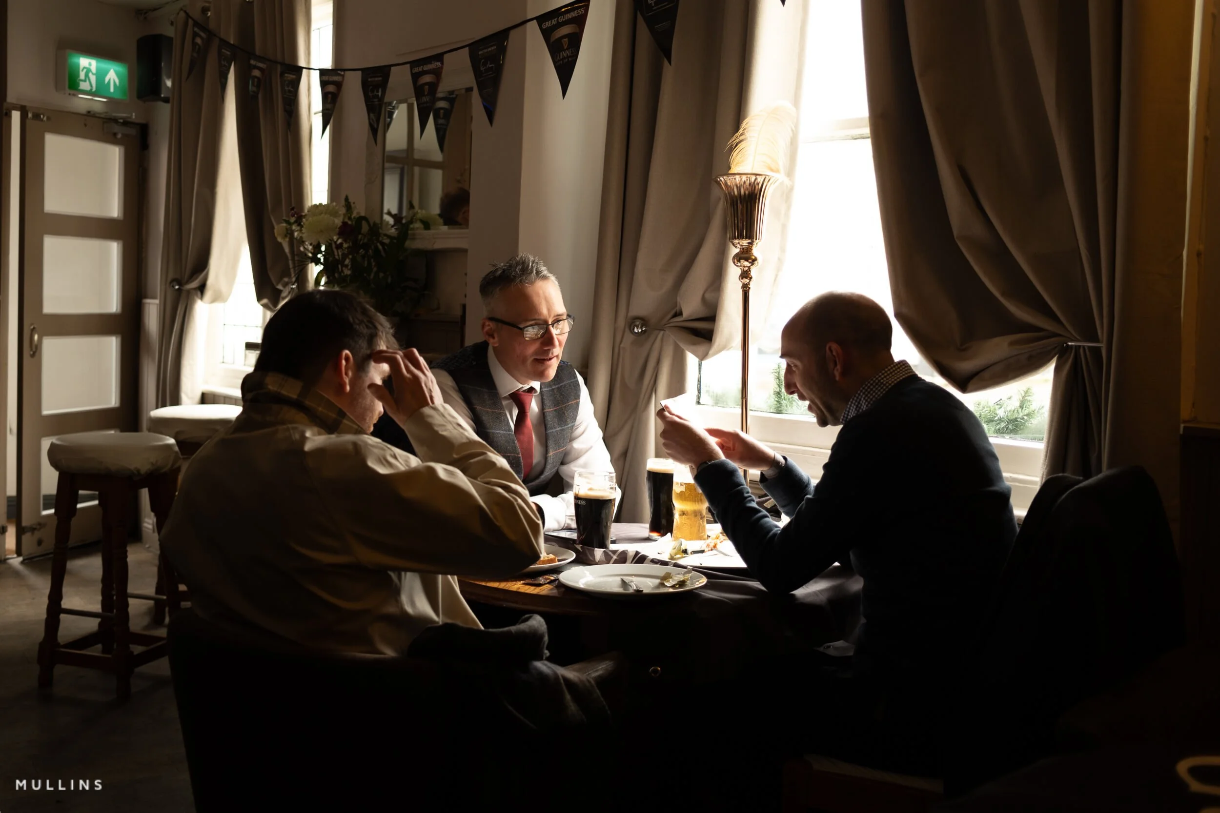
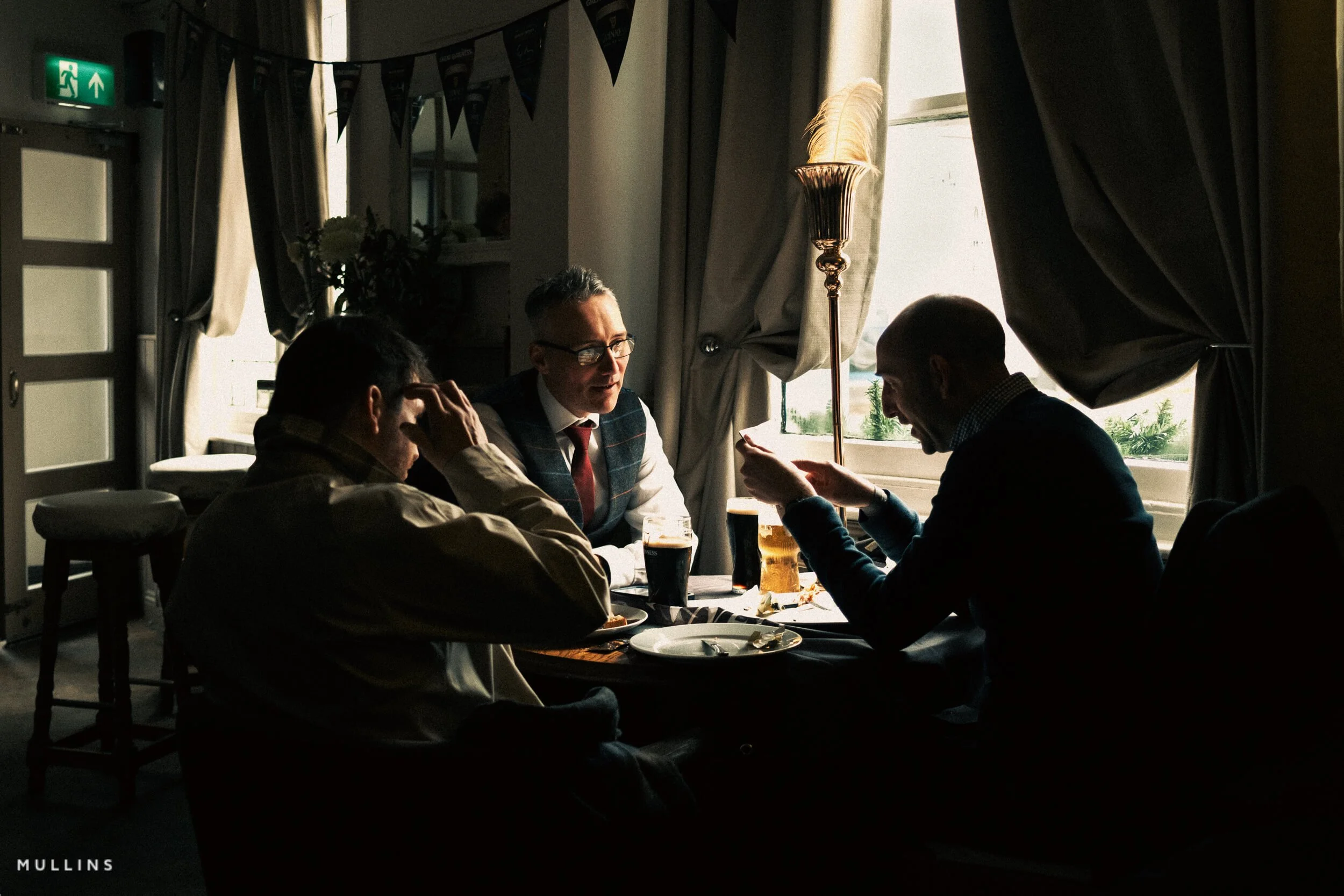
Example three: street or documentary frame with stronger structure

This edit starts with the Film Edition 5 Monochrome Pushed Tri-X (Hard Contrast) profile, then uses the Grain - Cinematic utility to add texture and reinforce the final look.
Not every filmic edit needs to be soft and dreamy.
Some images want more structure. Some want stronger blacks. Some want cooler shadows or a more muted palette so the composition comes together and the story is easier to see.
This is often true with street photography or candid documentary work where the geometry, timing, or gesture is the picture.
In those cases, the edit should hold shape as you are not trying to make it pretty. You are trying to make it feel right.
A filmic look here might mean pulling back overly bright colours, shaping contrast so the subject pops without looking HDR, and keeping the overall monochromatic look.
Shown here: this edit starts with the Film Edition 5 Monochrome Pushed Tri-X (Hard Contrast) profile, then uses the Grain - Cinematic utility to add texture and reinforce the final look.
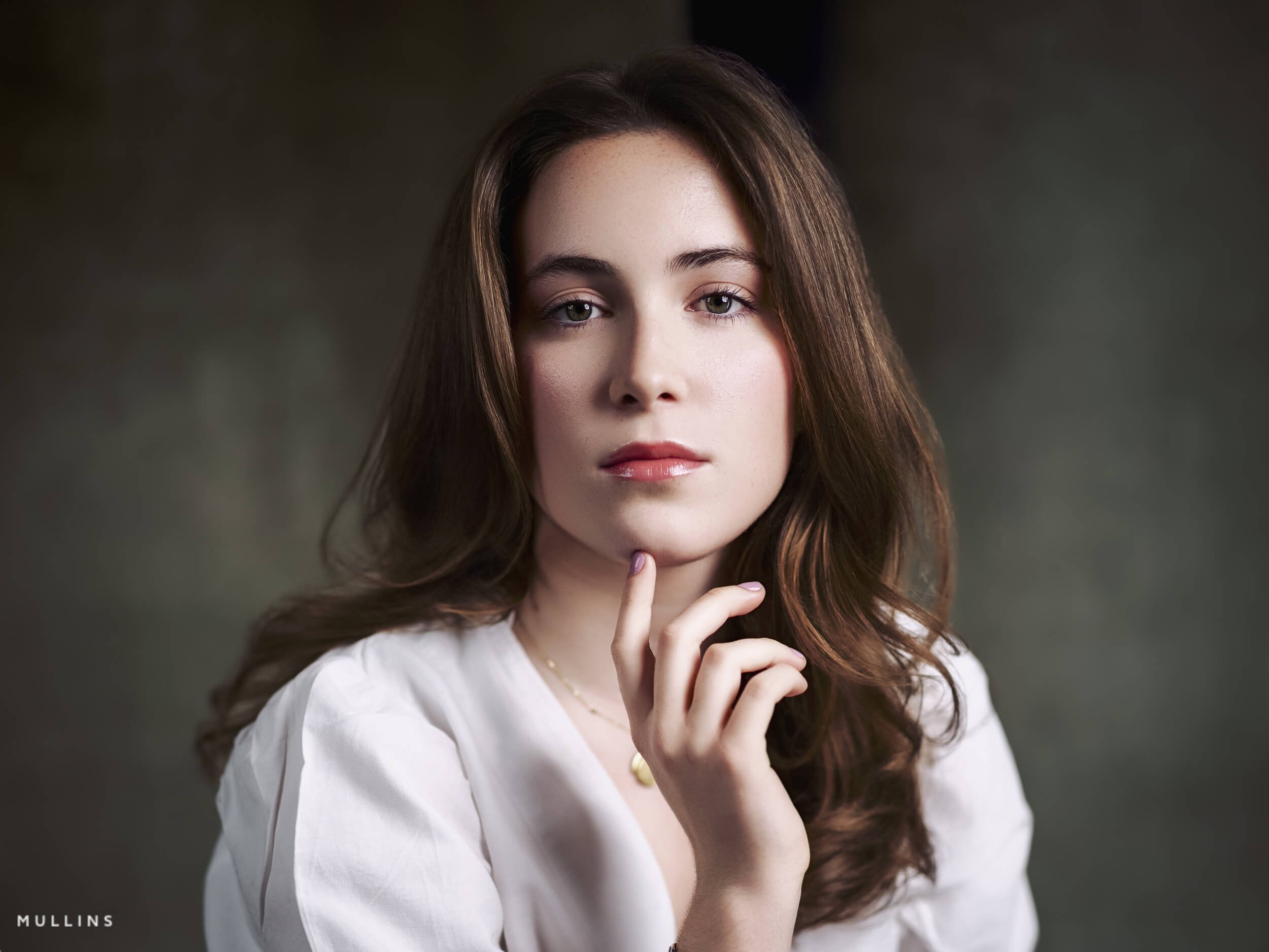
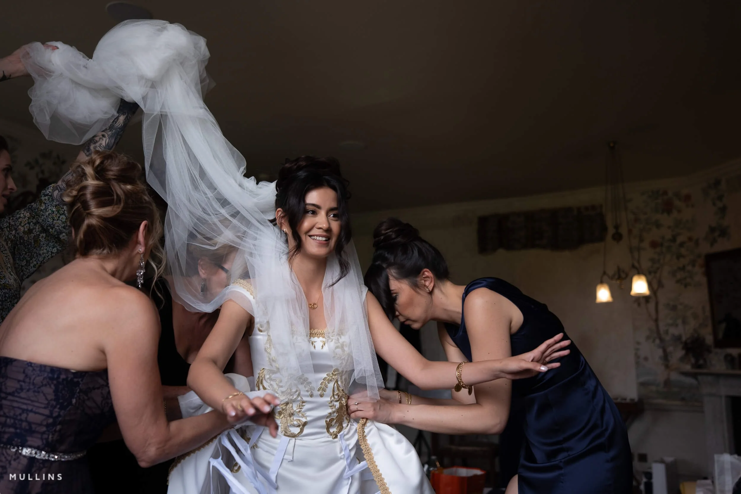
Example four: colour studio portrait with softer skin tones
This edit starts with the Film Edition 3 Colour Velvia profile, then uses the Film Look utility along with Density Standard to shape the final colour and tone.
Studio portraits are interesting because the light is controlled from the start, which sounds easier, but it can actually make the edit more complicated. When the file is very clean and very sharp, it does not take much for it to start feeling a bit too digital, as with my GFX100S Portrait Shoots.
That is often where a filmic look really helps.
With a colour portrait, I usually want the skin tones to stay accurate, the contrast to feel well defined rather than harsh, and the overall colour to sit together really well.
I don’t want the image to look flat, obviously, but I also don't want every detail pushed so hard that it becomes sharp and digital-looking.
A good filmic treatment for this kind of image can soften the more clinical edges of digital capture without making the portrait look washed out.
Skin still needs life in it.
Eyes still need to hold attention.
The face still needs shape.
But the transitions can be gentler, and the colour can be a little more subdued.
In native Lightroom, I would normally be paying attention to white balance, skin tone consistency, highlight handling, and how much clarity or sharpening the file really needs - especially if it’s going to be printed later.
A portrait can gain a lot just from slight colour correction, a softer tonal roll-off, and a touch of texture if it suits the subject.
If I were using one of my own preset workflows here, I would usually start with a base profile that gives me the right colour character, then refine the image with tone and grain utilities rather than forcing a heavy-handed look all at once.
In portrait work, filmic should not necessarily mean muddy or faded. It should mean controlled & flattering.
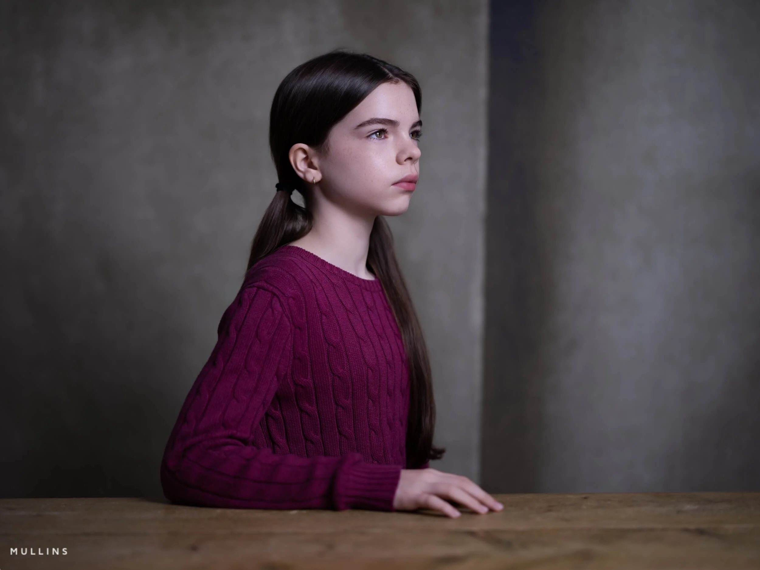

Shown here: this edit starts with the Film Edition 3 Colour Velvia profile, then uses the Film Look utility along with Density Standard to shape the final colour and tone.
The biggest mistakes people make when chasing a filmic look
Most of these are very fixable.
Starting with the effect, not the photograph
This is the main one. People decide they want “a film look” before they have looked properly at what the image actually needs.
Overdoing grain
Subtlety is best here. Too much grain on the wrong file just looks like noise.
Oversharpening and over-clarity
This is probably the quickest way to kill the image. If you want softness and atmosphere, you cannot also have every detail shouting at the viewer.
Trying to make every image look the same
This never really works. One of the nicest things about film, historically, is that different stocks, formats, lenses, and lighting conditions all gave different results. So, trying to force a single preset onto every file defeats the point.
Confusing desaturation with subtlety
Muting colour can help. Draining life out of the frame is something else entirely.
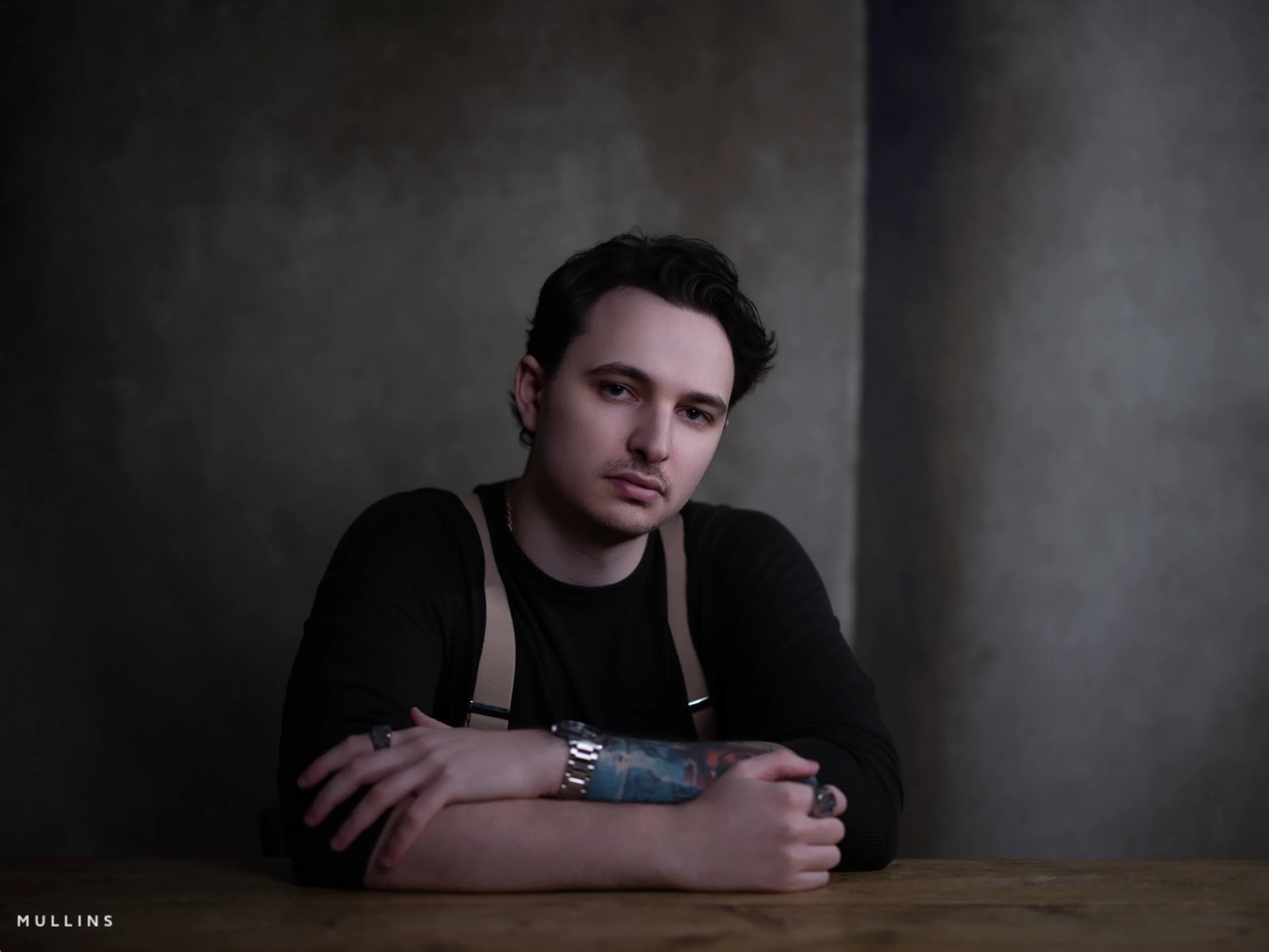
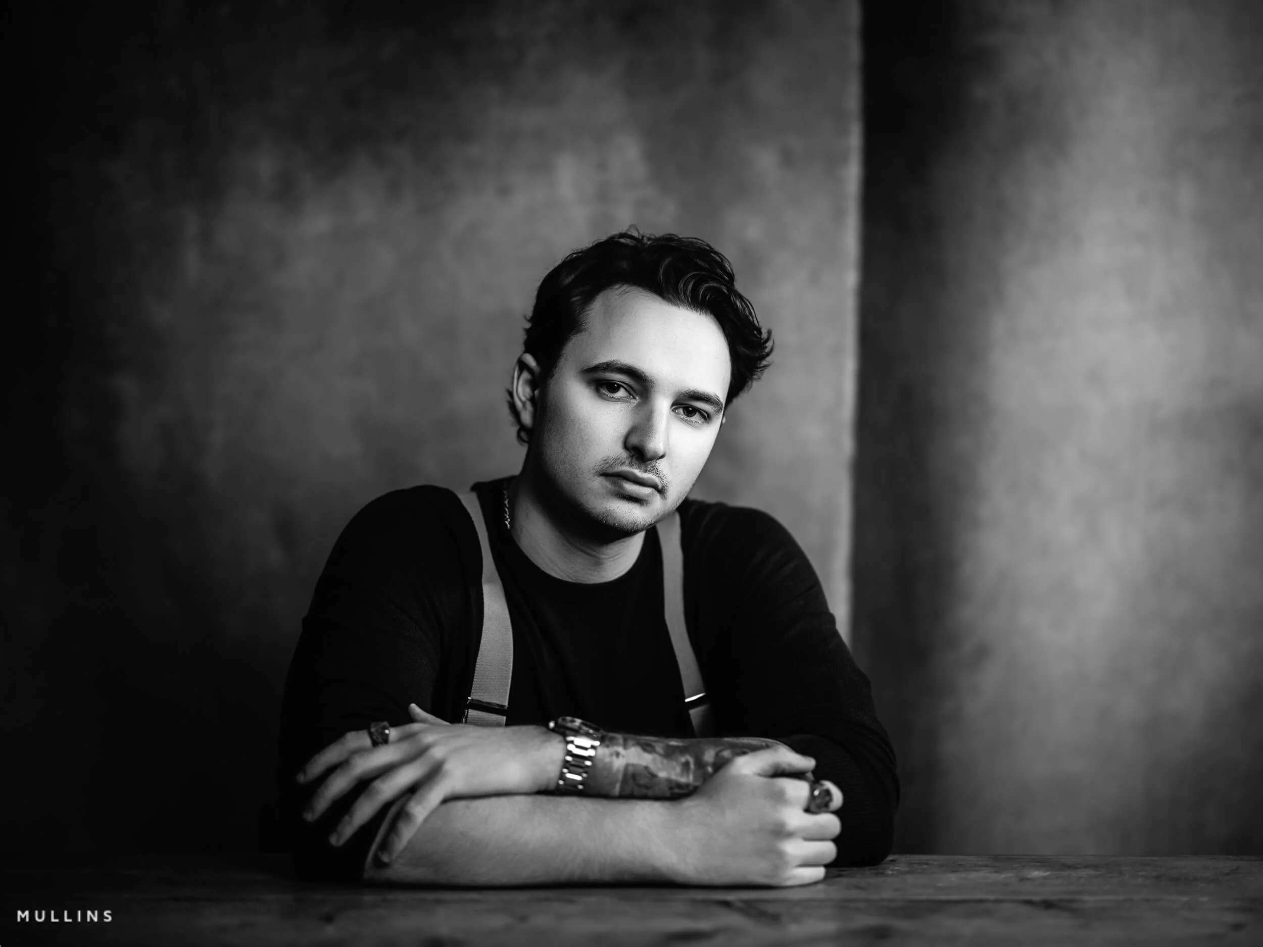
A Real Edit Using Film Edition 5 Colour
Sometimes it is easier to show this than explain it.
In the video below, I edit one photograph using the Chrome Profile from Film Edition 5 Colour as my starting point. I am starting from a profile that already has some character, then making small decisions from there.
What I like about the Chrome Profile is that it gives me a slightly calmer, more film-minded starting point straight away. The colours feel a little more settled, the image has some shape to it, and I am not fighting that overly clean digital look quite so much. From there, it becomes a case of refining.
That is usually where a more filmic result comes from, I think. Not from doing ten dramatic things, but from making a few sensible steps in the right order.
Why presets help, even if you can do some of it manually
I think this is where presets often get misunderstood.
A good preset is not there to do the thinking for you. It is there to get you to a better starting point more quickly. That’s really important when you are editing many images or when you want consistency across a series of photos.
That is the idea behind my own Lightroom preset packs. The base LUT profiles establish the primary look. The ready-made presets can get you going quickly. Then the Utilities let you adjust tone, grain, and finishing details so the image still feels well-edited and thought out.
So yes, you can absolutely do all of this manually in Lightroom.
But speed and consistency matter. And sometimes having a strong starting point means you spend more time responding to the image and less time rebuilding the same look from scratch over and over.
Want to get to these looks more quickly?
Everything shown in this post was edited using my own Lightroom preset workflow. The idea is not to replace judgement or make every file look the same. It is to give you a stronger starting point, speed up the process, and make it easier to build a consistent filmic feel across your images.
My preset packs include base LUT profiles, ready-built filmic looks, and Utilities for shaping tone, grain, contrast and density once the starting point is in place.
For photographers who want a quicker starting point
Start with a profile or preset that already has character, then refine from there instead of rebuilding the same look from scratch each time.
For photographers who still want control
The Utilities let you shape the result to suit the actual image, so the workflow stays flexible rather than feeling like one-click editing.
FAQ
-
Usually it is a combination of tone, controlled colour, subtle texture, and an overall edit that suits the subject and light. It is rarely just grain on its own.
-
Yes. Lightroom has everything you need. Presets just help speed up the process and make it easier to repeat a look consistently.
-
No. They are useful, but not necessary. A good preset is really a starting point, not a substitute for judgement.
-
No. Some images suit a softer, more atmospheric treatment. Others want something cleaner, brighter, or more neutral. The photograph should decide.
-
Tone, white balance, colour control, and texture are the big ones. Grain helps, but usually later in the process rather than at the start.
You Might Also Like:


A Showcase Overview of the Chrome Profile from Film Edition 5 - Colour.