My Best Lightroom Presets for Street Photography in 2025

The Best Lightroom Presets for Street Photography in 2025
If you shoot street, you’ll know just how much of the storytelling happens after you press the shutter. The way you edit—the tones you choose, the contrast you apply, even the texture of the image—can completely shift how the viewer feels. That’s why presets matter. Not because they make editing faster (though they do), but because they help you shape mood. Atmosphere. Identity.
Now, I’ve been developing my own Lightroom presets for years. These aren’t trend-based, throwaway filters—they’re built from the ground up, using custom colour and monochrome profiles that work across camera brands. In this post, I’m going to show you the ones I actually use—right now—in my own street photography.
This isn’t a sales pitch. It’s more like a guided tour of what works for me in 2025, why these particular looks have stuck, and what’s gone into building them over time.
Here’s what you’ll find in the post:
A short overview of what makes a great street photography preset
A look at how my Lightroom presets have evolved over the years
An explanation of what profiles are—and why they matter more than you might think
Real-world blurbs on the presets and profiles I’m using today (Du, Washi X, Iron Contrast, and more)
Practical tips for choosing a preset that fits your own style
This isn’t about following a formula. It’s about finding a look that feels like yours. Let’s dive in.
There’s something oddly satisfying about editing street photography.
It’s not like weddings, where you’re often dealing with tight timelines, mixed lighting, and high expectations.
With street, there’s more freedom. You shoot what you want. You edit how you feel. And for me, that makes the choice of preset even more important—not less.
I spend a lot of time talking about this on my Street Photography Workshops.
I’ve used Lightroom presets for years. Probably too many of them, to be honest. I’ve bought packs, downloaded freebies, created my own, deleted a load, and tweaked others into something barely recognisable.
The truth is, for street work, many presets out there just don’t hit the mark. They’re either too clinical, or they go so far that you lose all subtlety.
So, this post is about what actually works when you’re walking the streets with a camera and trying to capture something real. Human. Unposed.
A Quick Word About My Presets (and Their Evolution)
Before we go much further, I should probably explain something. The Lightroom Presets I use and sell aren’t some trendy pack I whipped up last week.
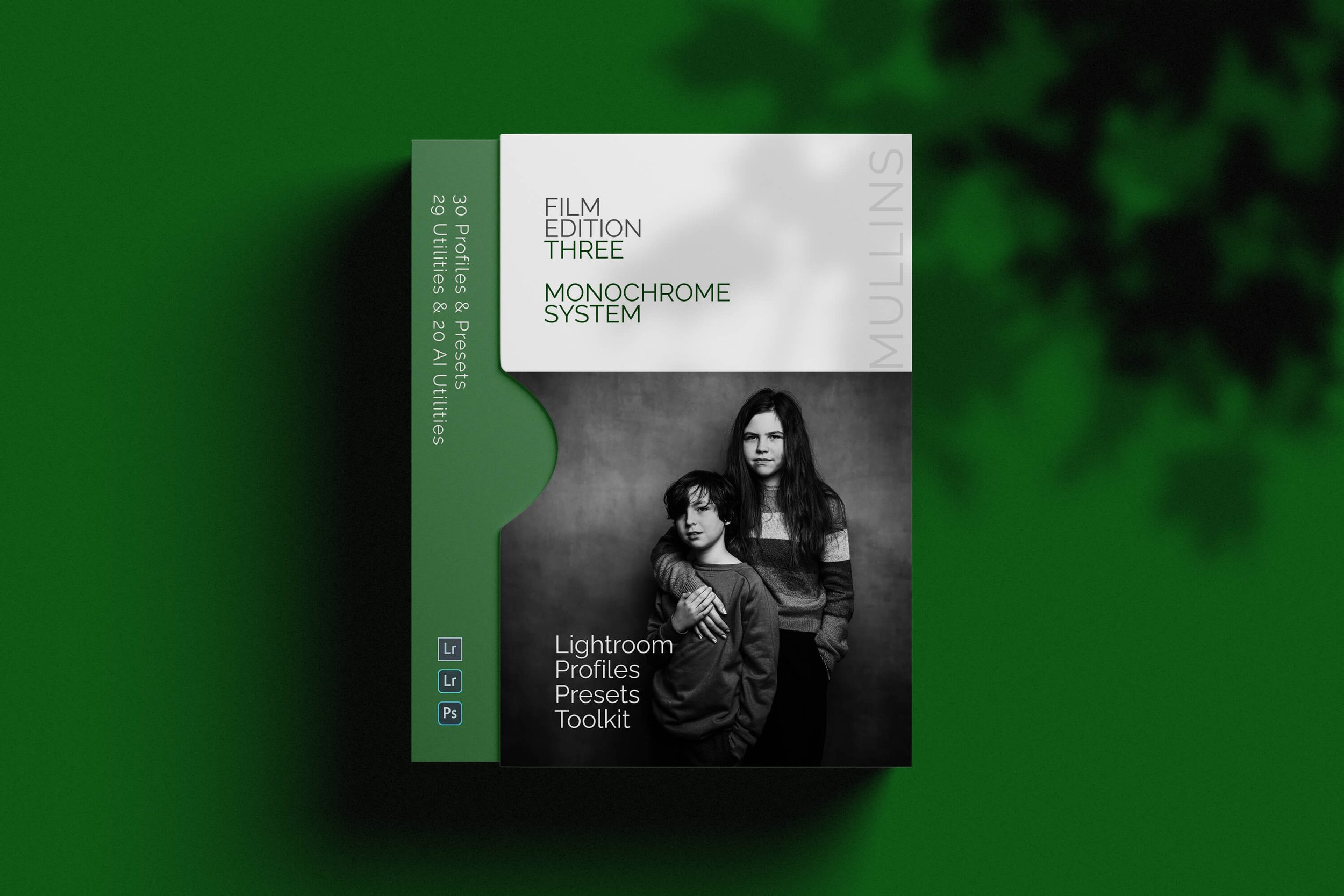
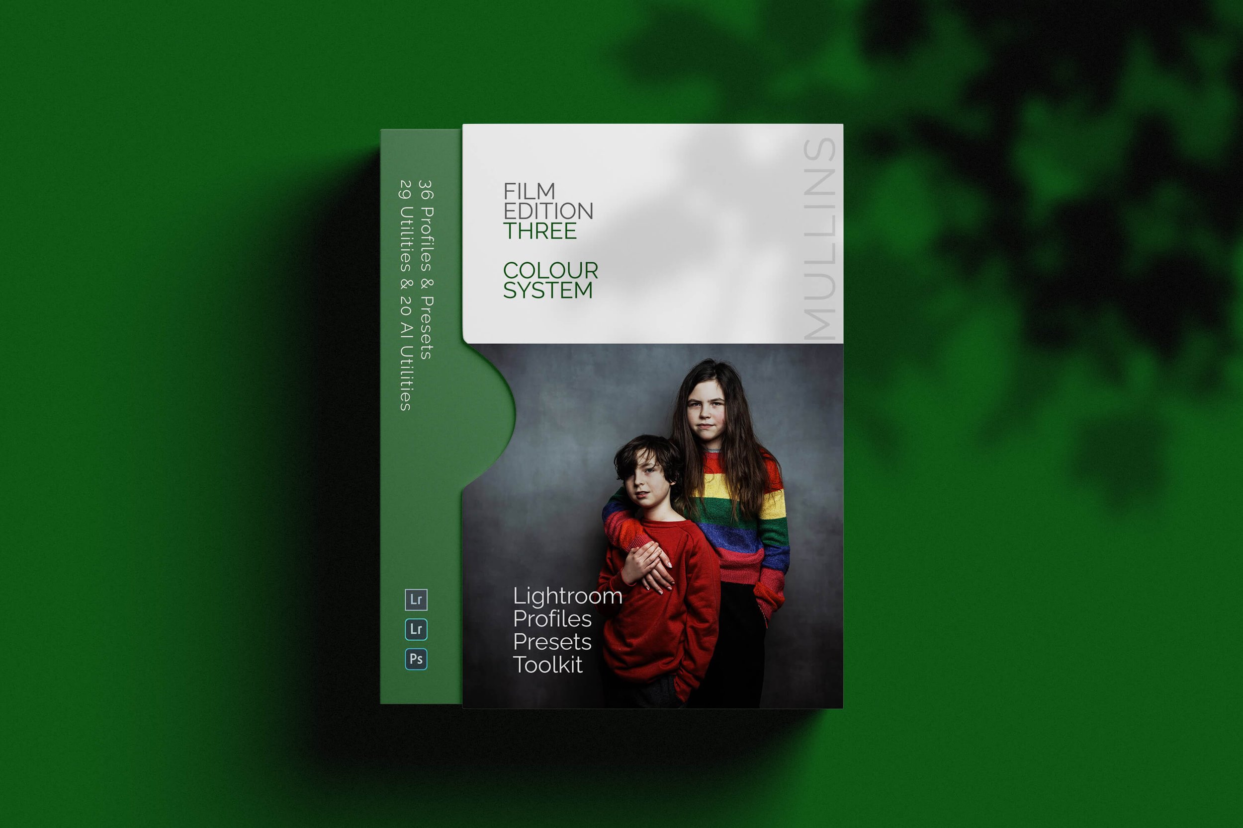
The very first set—Film Edition 1—came out years ago (in 2020), and I’ve released a new edition every so often since then.
Each one is built from scratch. They’re not “upgrades” or reworks—they’re new creative directions.
I mention that because some people assume Film Edition 4 is just a newer version of 1, 2 or 3.
It’s not. Each pack has its own look, feel, and purpose. Some are more cinematic. Others feel a bit rawer. But all of them are made with a street or documentary mindset.
You won’t find a single preset in there designed to turn a photo into something it’s not.
I suppose they’ve grown with me, in a way. As my photography’s changed, so has the way I edit—and the presets reflect that.
What Makes a Great Street Photography Preset?
I should probably start here, because not all presets are designed the same. A good street preset should do a few things:
It needs to protect texture. Grain should feel intentional, not slapped on like a filter.
It should let contrast breathe, especially in the midtones. Street shots often live there.
It can’t obliterate skin tones or shadow detail—because let’s face it, people are 90% of street work.
And perhaps most importantly, it should help guide the mood without overriding it.
I think of it like seasoning a meal. A good preset should enhance, not smother.
Why Profiles Matter More Than You Think
Here’s the part that often gets missed when people compare presets—the profile behind them.
A lot of presets (especially the free or cheaper ones) are just a collection of sliders saved in Lightroom. And while that can work, it means they rely completely on your camera’s built-in Adobe colour profiles. Which, let’s be honest, isn’t always the right look.
My presets are built around professionally made custom profiles—essentially colour engines designed to work alongside the sliders. That’s the difference between a preset that tweaks your image and one that transforms it (in a good way).
What this means in practice is:
You get much richer tonality, especially in tricky lighting.
Skin tones behave themselves—even across different camera brands.
The look is baked into the profile itself, so it stays consistent and reliable.
If you’ve ever had a preset look amazing on one image and completely fall apart on another, chances are it wasn’t profile-based.
Or if it was, the profile wasn’t doing much heavy lifting. It’s one of those invisible things that make a huge difference—especially when you're editing hundreds of images from different shoots.
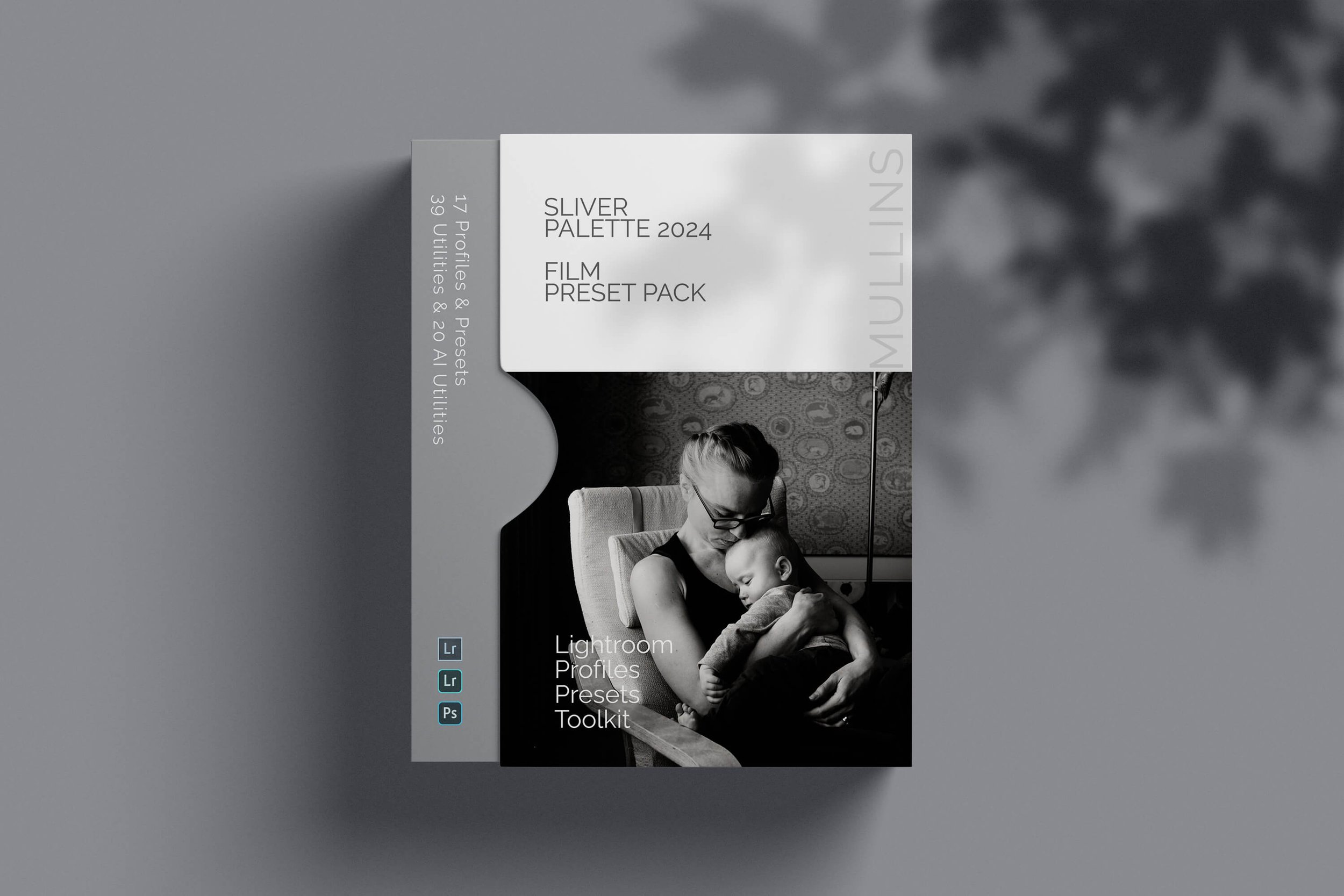
When working with my Lightroom Preset Packs, you may have noticed two key elements—profiles and presets. While they might seem similar, they serve very different purposes in your editing workflow.
In this video, I’ll break down exactly how they work and how you can use them effectively.
Presets I Use for My Own Street Photography
So let me walk you through a few I personally use. These are from my own collection—yes, a bit of a plug, but I genuinely use these every day.
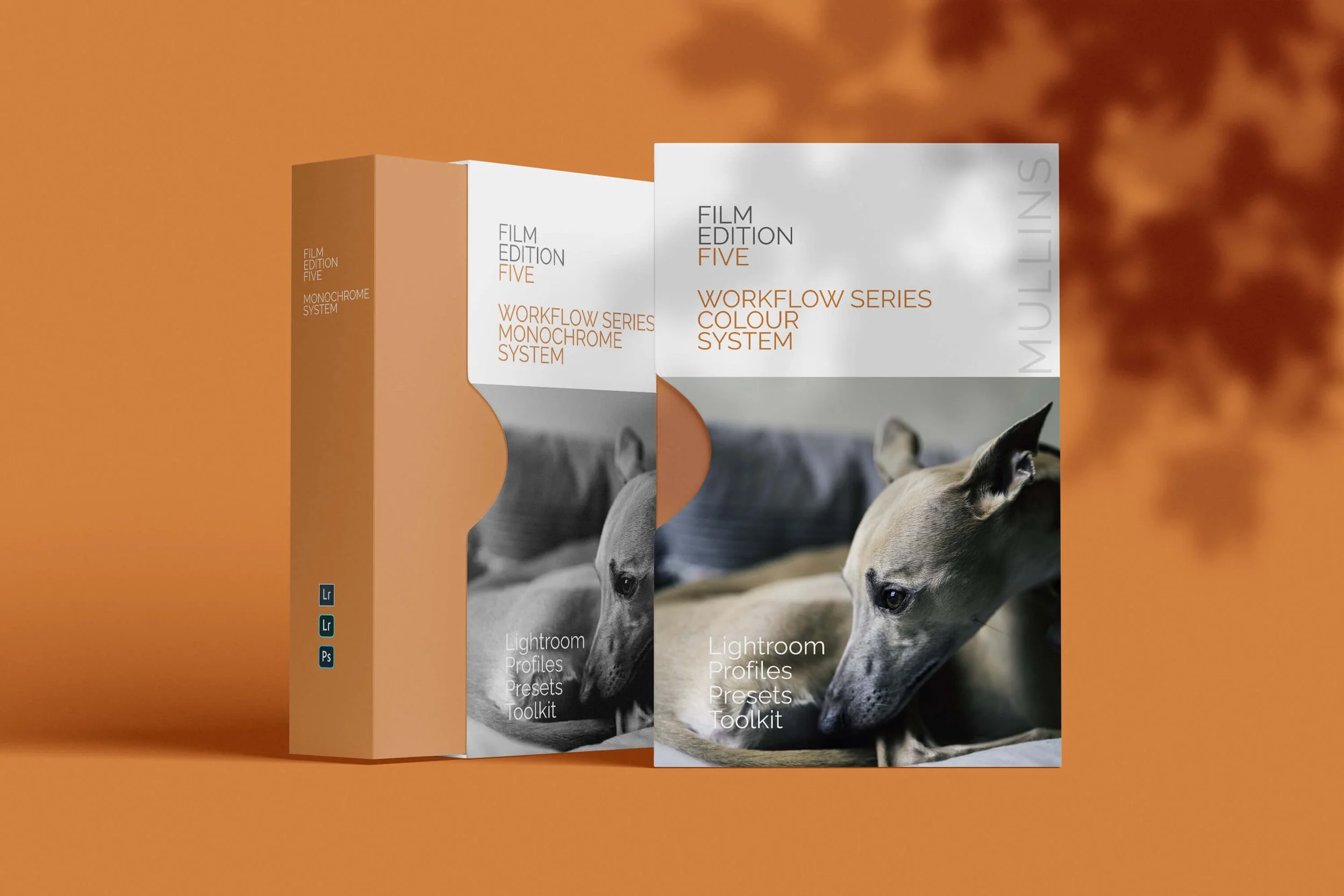
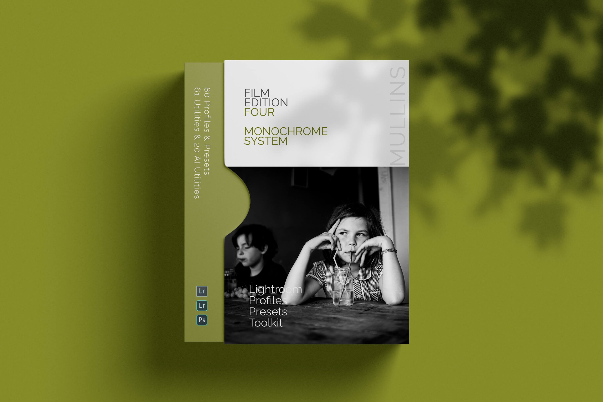
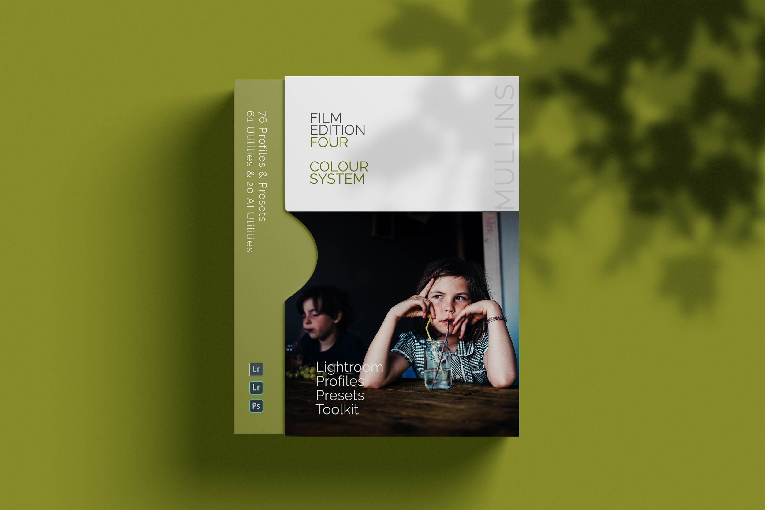
They’re part of the Film Edition 4 pack, which I built specifically for this kind of thing.
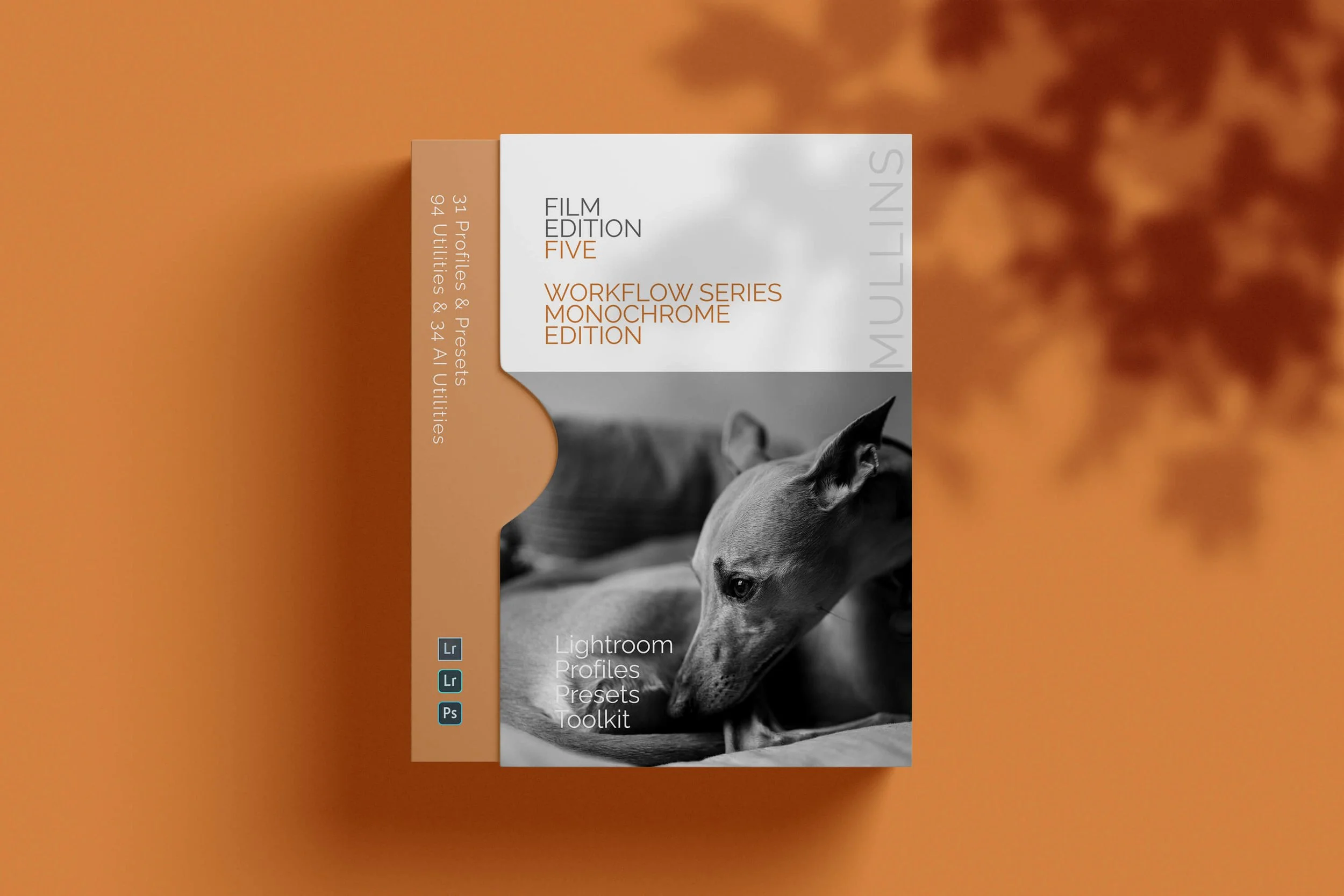
01. Du Preset from Film Edition 4 Lightroom Presets - Monochrome
This is probably the one I use the most right now. It’s got that moody, punchy feel I always chase in my monochrome work—without going too crushed or too clinical. Du is built around the Mono Signature 2025 C profile, which I developed after what felt like months of tweaking. I wanted something that could handle deep blacks without choking the detail out of shadows, especially in tricky lighting.
There's a sort of heaviness to it—but in a good way. Not every shot suits it, but when it lands, it really anchors the mood.
I find myself using it on everything from street portraits to wider, more observational frames.

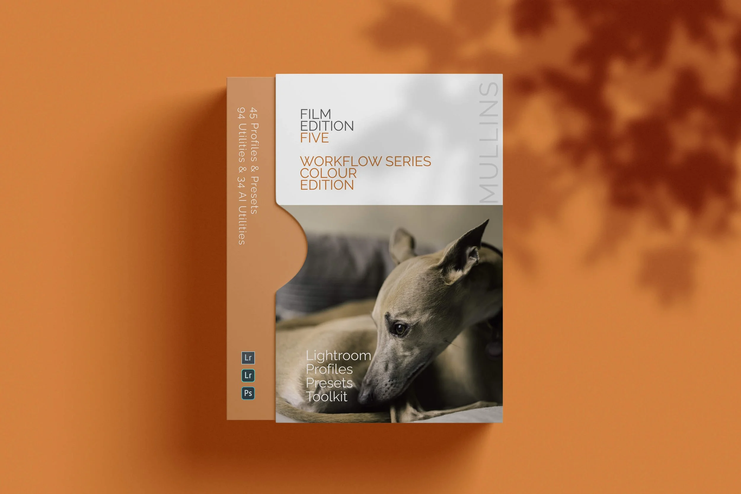
02. Washi X from Film Edition 4 Lightroom Presets - Colour
This one’s a bit different. It’s built on the Washi X profile, which I designed to bring out something quieter in colour work—something more delicate.
I was originally trying to mimic that thin, fibrous texture you get from traditional washi paper prints. It’s subtle, slightly soft around the edges, but still holds a certain clarity where it matters.
There’s a warm, almost nostalgic tone baked into it. Like the colour you remember something being, rather than how it actually looked. I use this a lot when I want a scene to feel thoughtful, maybe even a touch melancholic. Street corners, lone figures, quiet light. That sort of thing.
Not everyone's favourite, maybe. But for me, it's become one of those go-to looks when I want the image to breathe a little slower.

03. Iron Contrast Preset from Film Edition 4 Lightroom Presets - Monochrome
This one’s a bit of a heavyweight. Iron Contrast is also built on the Mono Signature 2025 C profile—same as Du—but it pushes everything that bit further. The blacks go deeper, the contrast is more assertive, and there's almost a metallic edge to the way it handles light. Hence the name.
I tend to reach for this when I want the image to really bite. It’s brilliant for harsh midday shadows, strong architectural lines, or moments that already carry a bit of grit.
That said, it’s not forgiving—if your exposure’s off or the composition’s a bit loose, it won’t hide it. But that’s partly why I like it. It’s honest. Bold.
It’s probably not the one I’d use every day, but when the light’s right and the scene calls for impact, it’s hard to beat.

Watch this Video to see how I use the Monochrome Signature C Profile.
04. Kodachrome True Film from Film Edition 4 Lightroom Presets - Colour
This one’s probably the most nostalgic preset I’ve built—Kodachrome True Film, based on my custom Kodachrome profile.
I spent a long time getting this one to feel right. Not just the colour palette, but the texture of it. The grain here is deliberate—quite prominent, actually—but it mimics that classic Kodachrome look in a way that feels organic, not forced.
It’s rich but not over-saturated. The reds have that warmth without going full tomato, and the blues lean cool without turning plastic.
Skin tones hold up beautifully too, which was always the hallmark of real Kodachrome. I think what I like most is the way it handles ambient light—street lamps, window reflections, that golden-hour haze—it just eats that stuff up.
I don’t use it on everything, obviously, but when I want something to feel timeless (or when a shot already has that 70s documentary vibe), this is the one I go to.

05. Colour Signature 2025 B – Profile Only from Film Edition 4 Lightroom Presets - Colour
This one isn’t a preset—it’s just a profile. But I say “just” loosely, because the Colour Signature 2025 B profile is the base I often start from when I want full control but still want that underlying tonal feel baked in.
It leans ever so slightly warm in the highlights, keeps the shadows honest, and just adds a gentle richness across the board. I think of it as a clean slate with personality—it doesn’t fight you when you start tweaking sliders on top, which is exactly what I need sometimes.
If you’ve got your own workflow or you like building custom looks, this profile gives you a solid starting point that doesn’t feel too “default.” I often build new ideas off this one when I’m testing things out or editing something that doesn’t quite suit my usual presets.
06. Foma R100 True Film – Profile Only from Film Edition 4 Lightroom Presets - Monochrome
This one’s got a bit of bite to it—Foma R100 True Film is built around my custom Foma R100 monochrome profile, which was designed to echo the feel of that classic Czech black and white film. It’s got a slightly gritty texture, plenty of contrast, and a dry, almost matte quality to the midtones that I really like.
There’s a subtle coarseness to the grain—it’s not overly smooth or polished, and that’s the point. It gives images a sense of physicality. Almost like they’ve been pulled from a contact sheet. It works particularly well in overcast light or when there’s a strong subject–background relationship, where you want the story to feel stripped back and raw.
I wouldn’t call it elegant. But it’s honest. And for a lot of the street work I shoot, that’s exactly what I want.

How to Choose the Right One (When You’re Overwhelmed)
If you’ve ever loaded up 20 presets and clicked through them all in quick succession—hoping one will suddenly feel right—you’re not alone. I’ve done it more times than I care to admit. Honestly, that’s not how presets are meant to be used.
Instead, I’d suggest picking two or three that suit your general vibe. One that leans bold and contrasty. One that's more muted and cinematic. And maybe one wildcard. Use them consistently for a few weeks.
Get to know them. Let your editing become instinctive rather than reactive.
Street photography thrives on instinct.
Presets Aren’t a Shortcut — They’re a Language
I know this might sound a bit lofty, but hear me out. A well-made preset isn’t just a way to speed up your editing.
It’s a way to communicate. To say, “This is how the world looked to me at that moment.” When you find a set that reflects how you see things, it helps reinforce your visual identity without you even thinking about it.
And over time, that style becomes yours.
A Final Word
I’ve always thought the best street photographs feel like overheard conversations. There’s tension, subtlety, odd detail. A good preset should echo that—it shouldn’t shout. It should just nudge things into place.
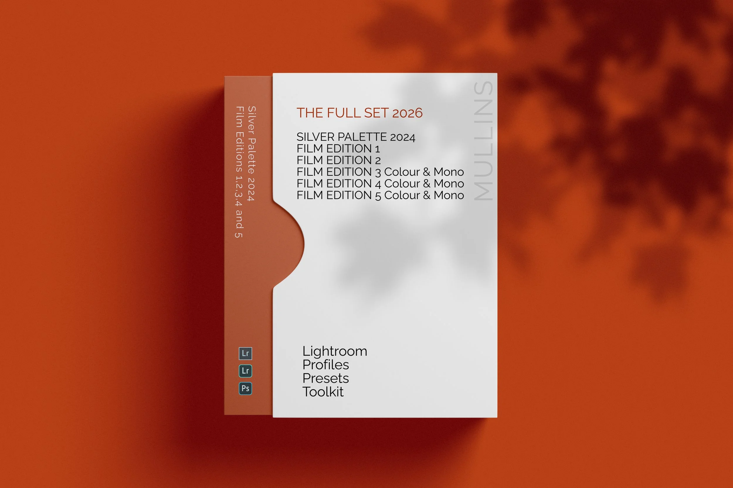
If you want to try the ones I mentioned above, they’re all part of my Film Edition 4 Lightroom Presets.
Street photography is already hard enough. Your editing shouldn’t be.


FAQ Lightroom Presets for Street Photographers
-
Yes — absolutely. Although I shoot mainly on Fujifilm, all of my presets (including those in this post) are designed to work with files from any camera—Canon, Nikon, Sony, Olympus, even iPhones. That’s because the magic isn’t in the camera—it’s in the custom profiles I build from scratch for each look.
-
A preset is a saved combination of slider settings in Lightroom (contrast, exposure, tone curve, etc.). A profile, on the other hand, is more like a custom film stock baked into the base of your image. My presets are built on top of bespoke profiles, which is what gives them their depth, texture, and consistency—especially across different lighting and cameras.
-
You’ll need Lightroom Classic or the desktop version of Adobe Camera Raw (ACR) to use my full preset packs.
-
Each Film Edition pack is a completely new set of looks—not upgrades or tweaks of earlier versions. Film Edition 1, 2, 3, and 4 were all built from the ground up, using different profiles, moods, and styles. They evolve as my photography evolves. Think of them like chapters rather than versions.
Further Reading & Resources