

Film Recipe - Newspaper - Film Base (Monochrome)
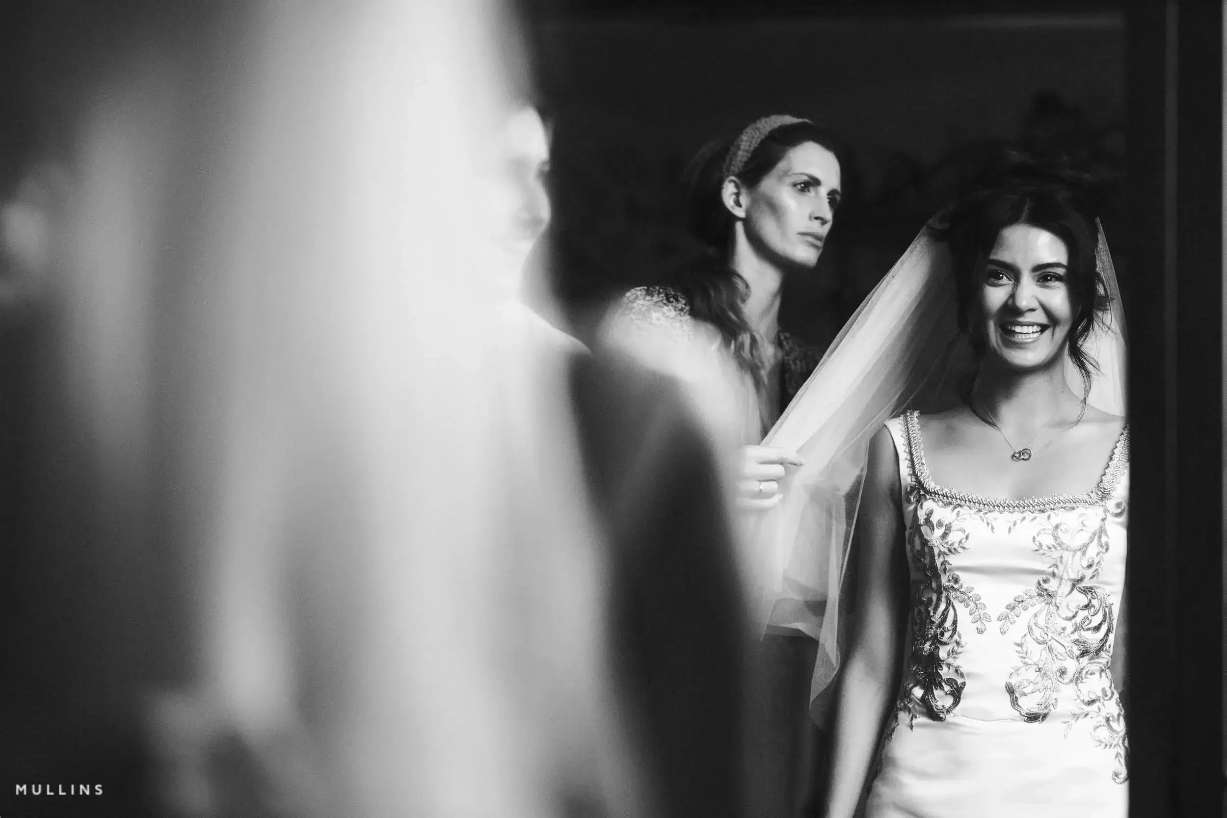
Newspaper Black and White Fujifilm Recipe
Newspaper Fujifilm Film Recipe
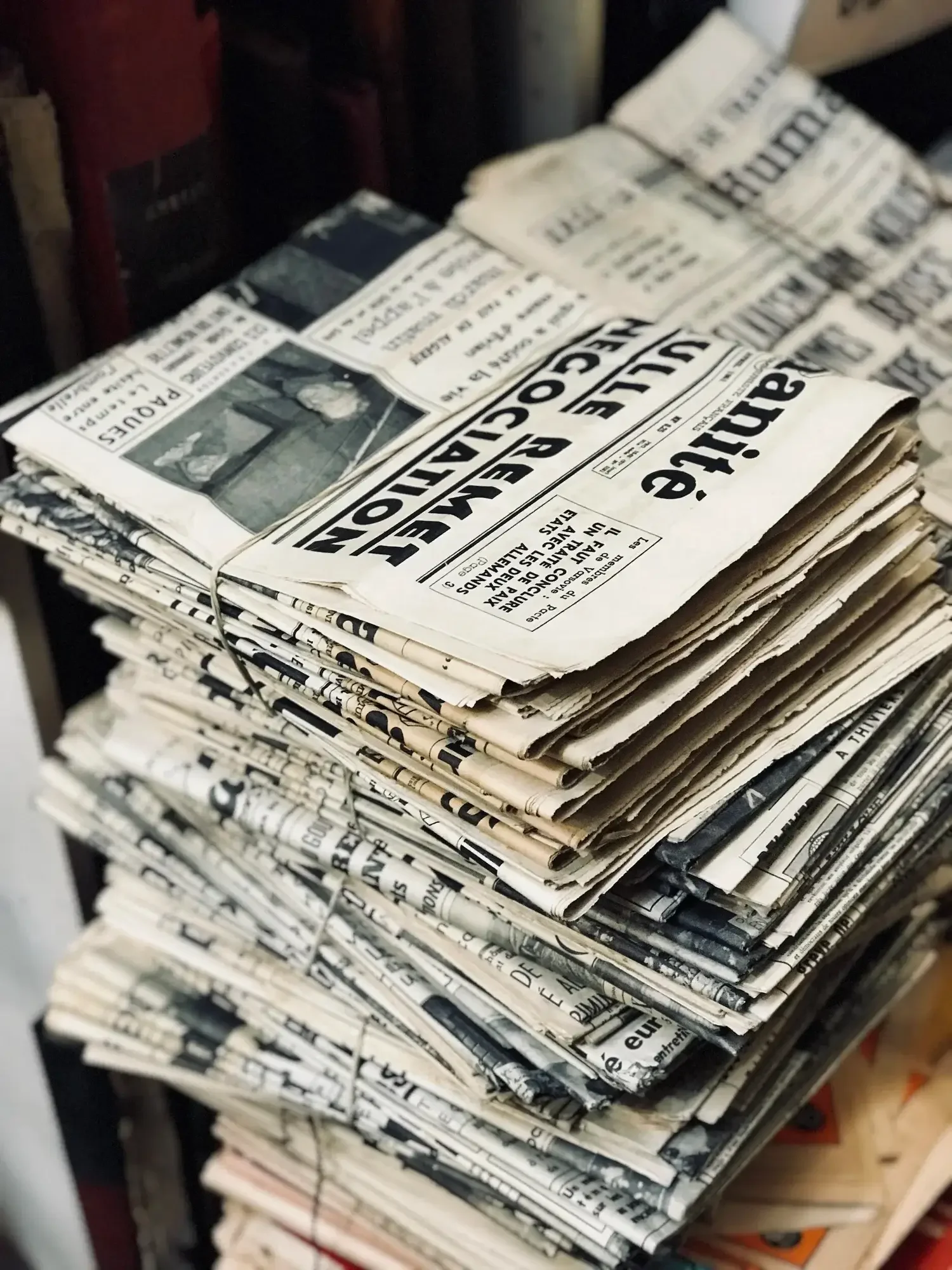
This recipe is a nod to the days when the world arrived in black and white, printed on cheap paper and dropped on doorsteps. Newspaper is inspired by the high-contrast, rough-textured look of black-and-white press photography from the 1970s and '80s—images made for impact, not subtlety.
Back then, the printing process forced everything through a halftone screen—tiny dots that stood in for smooth tones. It gave photos that gritty, almost broken-up texture. Highlights were often blown out, shadows collapsed, and yet… it worked. There’s a charm to it. A kind of urgency. These images weren’t perfect, but they were unforgettable.
This recipe channels that feeling. High contrast, pronounced grain, and a cool tone shift that pushes it just a little further from polished digital monochrome and closer to the imperfect beauty of the printed page.
Fujifilm JPEG Settings:
Film Simulation - Acros + YeGrain Effect - StrongGrain Size - SmallWB Shift - R:-4 B:-3Highlight Tone - +4Shadow Tone - +4Sharpness - +2Clarity - 0
NOTE: Some settings may not be available on every Fujifilm Camera
Notes on the Settings
ACROS+Ye brings a balanced monochrome base with just enough punch in the contrast. It works well with grain-heavy looks without becoming too aggressive.
Grain Effect: Strong / Small mimics the halftone texture you’d get from old newsprint. It doesn’t look exactly like ink on paper, of course, but it adds a tactile roughness that helps get you there.
White Balance Shift R:-4 / B:-3 cools the tones noticeably. This might surprise you at first—most recipes warm things up—but that slightly bluish cast works beautifully when you want something to feel detached, a little cold, even historical.
Highlight and Shadow Tone +4—both maxed out. This is what gives the image that sharp newspaper contrast. Bright areas blow out, darks drop away. It’s not about preserving detail—it’s about making a bold visual statement.
Sharpness +2 ensures edges stay crisp, especially when there’s a lot of grain and tonal compression.
Clarity 0 is intentional. Adding it here would modernise the look too much. Let the contrast and grain do the heavy lifting.
High ISO NR at 0 keeps it neutral. You could drop it to -2 or -4 if you want even more texture, but for this one, I’ve kept it clean-ish.
Creative Reasoning
Newspaper is perfect for storytelling in harsh light, street scenes with bold shadows, or even detail shots where texture and contrast carry the emotion. It flattens the image a little, but that’s part of the charm—it feels more like a page than a screen.
There’s a kind of honesty in the way it renders the world. Like a memory—not quite accurate, but full of character.
It’s not about perfection. It’s about impact.
Newspaper: Black & White Film Simulation Recipe (Sample Images)


If you prefer Shooting RAW:
Those of you who prefer to shoot RAW and edit with the more advanced latitude this gives you may be interested in my current set of Professionally designed profile-based Lightroom and Adobe Camera Raw Presets.
Newspaper: More Sample Images





A complete black and white Profile, Preset & Workflow Pack for Lightroom
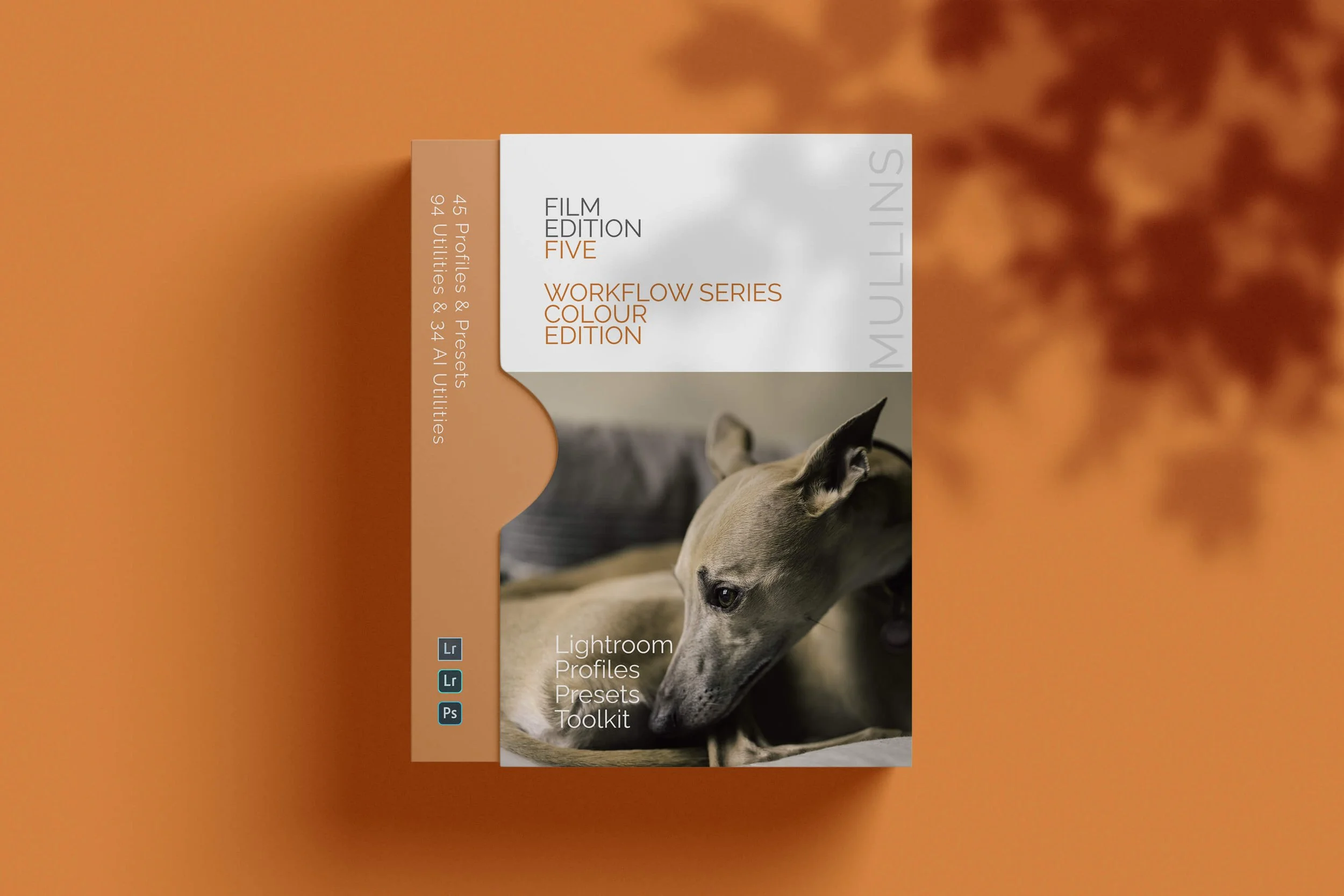
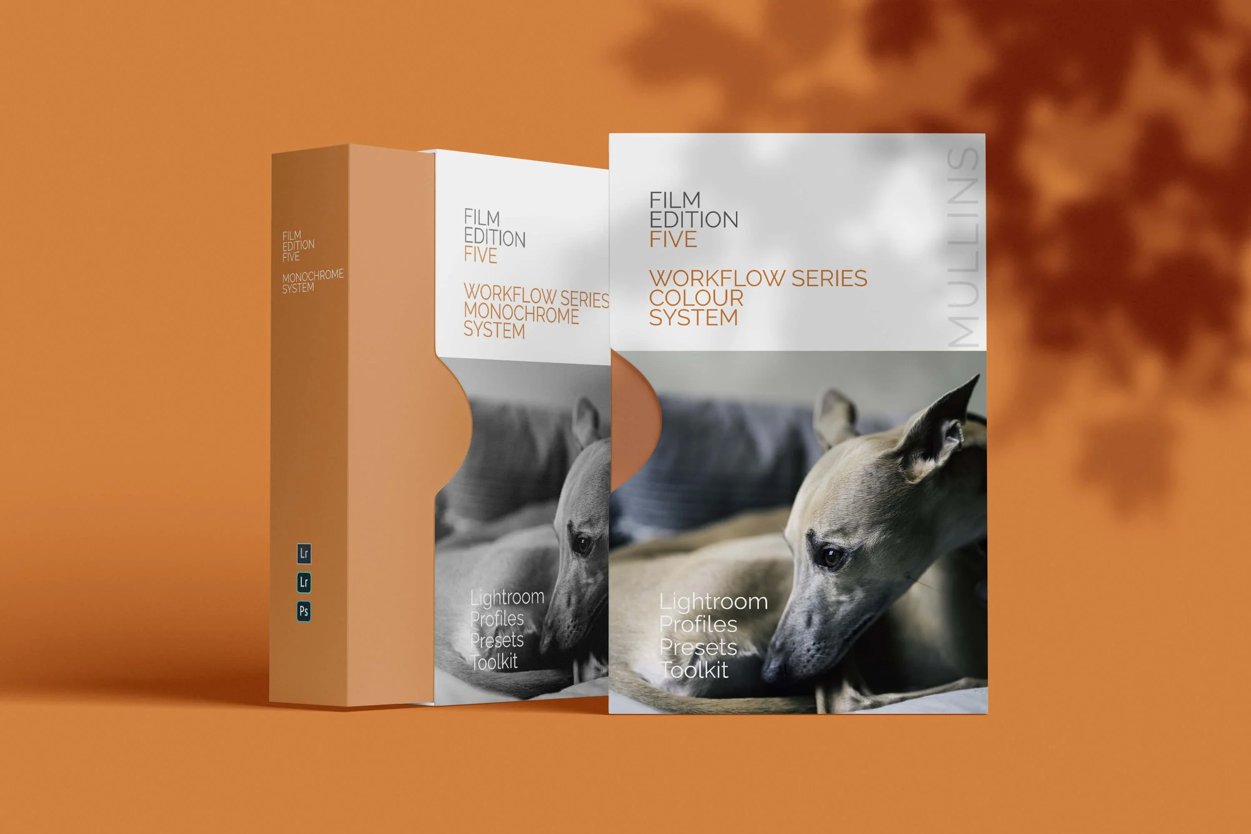
Film Edition 5 - Workflow Series (Monochrome) is a structured set of Lightroom profiles and presets designed to help you achieve a finished monochrome look quickly and consistently.
This is not a random “pick a look and hope” pack. It’s designed as a repeatable workflow you can run on a full set of images, with fixes and finishing tools when you need them.
If you edit regularly in Lightroom, you already know the problem. You want a strong black-and-white style, but you also need it to behave consistently across different scenes, lighting conditions, and subjects. This pack is designed to help you move fast without the work looking rushed.
You start with one of the custom monochrome profiles to establish the tonal foundation, then shape the image with workflow presets that are designed to work with that profile rather than fight against it. From there, you can use the included Toolkit for things like AI masking, grain, curves, highlight control, sharpening, finishing touches, and everyday problem-solving inside Lightroom. The product page positions the pack exactly this way, with the profile first, workflow second, then utilities and finishers to refine only when needed.
Built for speed and consistency
If you edit your photos in Lightroom, you already know the problem: you want a strong monochrome style, but you also need it to work across different scenes without constant fighting.
This pack helps you move fast without the work looking rushed.
Fast workflow: fewer decisions, clearer steps.
Consistent results: the set hangs together as a series.
Film-inspired tonality: depth, shape, and texture without the “preset look”.
Useful fixes included: real-world Lightroom problems, solved quickly.
What’s included
11 custom monochrome profiles
20 one-click presets
128 Mullins Lightroom Toolkit presets, including AI masks, fixes, utilities, grain, tone curves, colour helpers, sharpening and finishers
Compatibility
Works with Lightroom Classic and Lightroom Desktop. AI Mask presets require Lightroom Classic 11.0+ or Lightroom Desktop 5.0+.
Three for Two Offer
All preset packs are included in the 3-for-2 offer. Add any three preset packs to your basket, and the cheapest one is free at checkout.