

Film Recipe - 50s Noir - Grainy Film Base (Monochrome)

50s Noir Monochrome Fujifilm Recipe
50s Noir Fujifilm Film Recipe

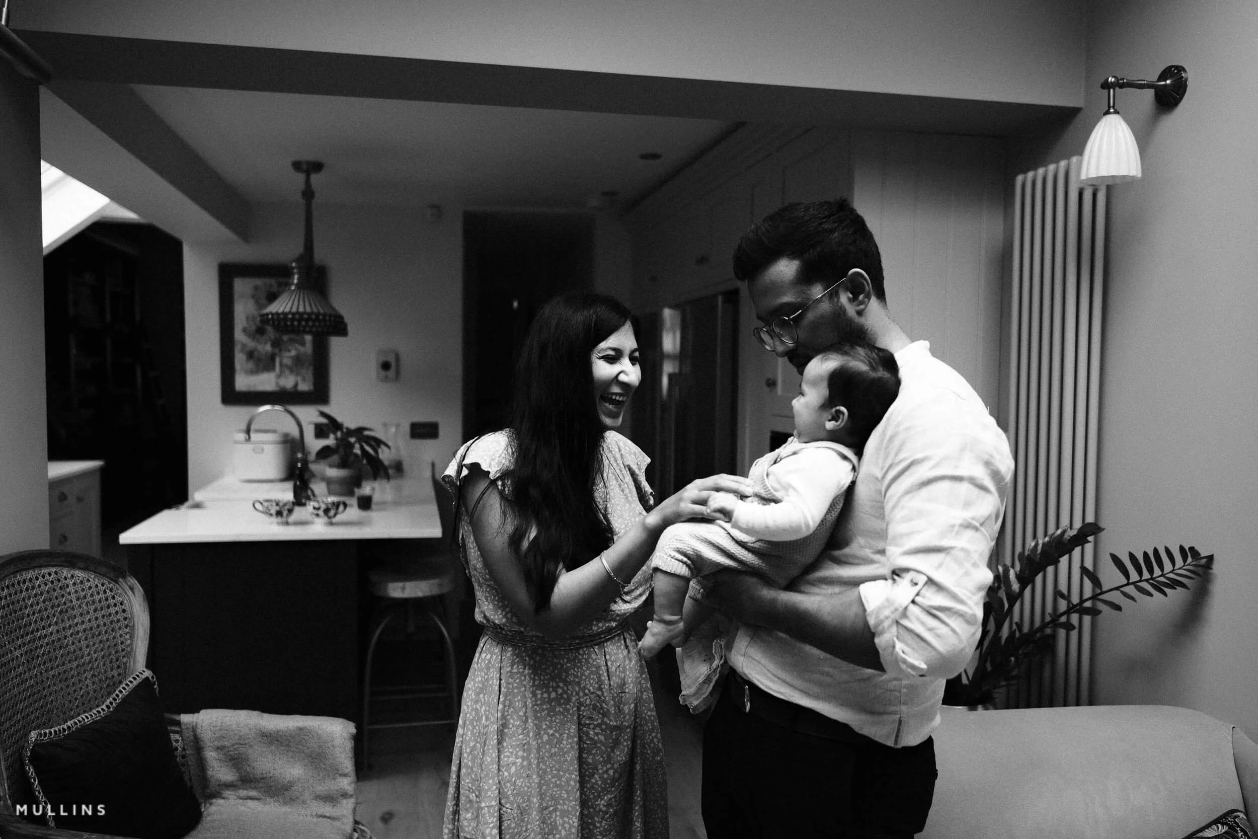
This one is all about mood. 50s Noir pulls directly from the visual language of post-war cinema—those shadowy, high-contrast frames full of moral tension, mystery, and cigarette smoke. It’s not a soft look. It doesn’t aim for balance. It leans into deep blacks and bright whites, the kind of tones that force the eye to move across the frame.
You don’t need a trench coat and Venetian blinds to use it. But it helps to think in that space—gritty corners, dark alleyways, expressions that say more than words. It’s made for tension and ambiguity. There’s something in the shadows. Or maybe not. The recipe doesn’t care if the story’s clean. It just wants to feel cinematic.
Fujifilm JPEG Settings:
Film Simulation - Acros + YeGrain Effect - StrongGrain Size - LargeWB Shift - R:-3 B:-3Highlight Tone - +4Shadow Tone - +4Sharpness - +4Clarity - +1
NOTE: Some settings may not be available on every Fujifilm Camera
Notes on the Settings
ACROS+Ye gives you contrast without going straight to harsh. It keeps the blacks deep and clean, and holds some structure in midtones—essential when you're already pushing the extremes elsewhere.
Grain Effect: Strong / Large helps sell the illusion. It gives the frame a printed quality, like it’s been pulled from a contact sheet rather than a digital sensor. Up close, you’ll see it. But that’s the point.
White Balance Shift R:-3 / B:-3 cools everything down. It’s a subtle nod to the emotional tone of classic noir—cool, distant, unsure. It pulls you away from the warmth of modern black-and-white.
Highlights and Shadows both at +4. Maximum contrast. Detail will be lost. That’s okay. It’s supposed to feel graphic, not gentle. Let the shadows go. Let the highlights burn. If anything, that tension is what makes it feel cinematic.
Sharpness +4 pushes the edges further. This recipe doesn’t want softness or subtle gradation. It wants the outline of a hat, the glint in an eye, the shape of a lamppost disappearing into fog. It thrives on definition.
Clarity +1 gives just a little extra depth to surfaces, especially in midtones. Enough to give presence without the lag that comes with higher values. You could take it higher if you don't mind the slowdown, but +1 hits a nice balance.
High ISO NR 0—left neutral. The grain’s already doing its job, and anything more starts to polish a look that shouldn’t be polished.
Artistic Reasoning
50s Noir works best in hard light or deep shadow. It responds well to strong shapes—bold compositions where negative space and contrast do the storytelling. Alleyways, architectural lines, harsh afternoon light, long shadows across faces.
It doesn’t work everywhere. Flat light, for example, can leave it feeling a bit uninspired. But in the right scene—especially one with ambiguity or tension—it clicks. Suddenly, the frame feels like a still from a forgotten film. You’re not just photographing a place or a person. You’re hinting at a story behind it.
And maybe it’s not even clear what that story is. That’s part of the charm
50s Noir: Grainy Colour Film Simulation Recipe (Sample Images)


If you prefer Shooting RAW:
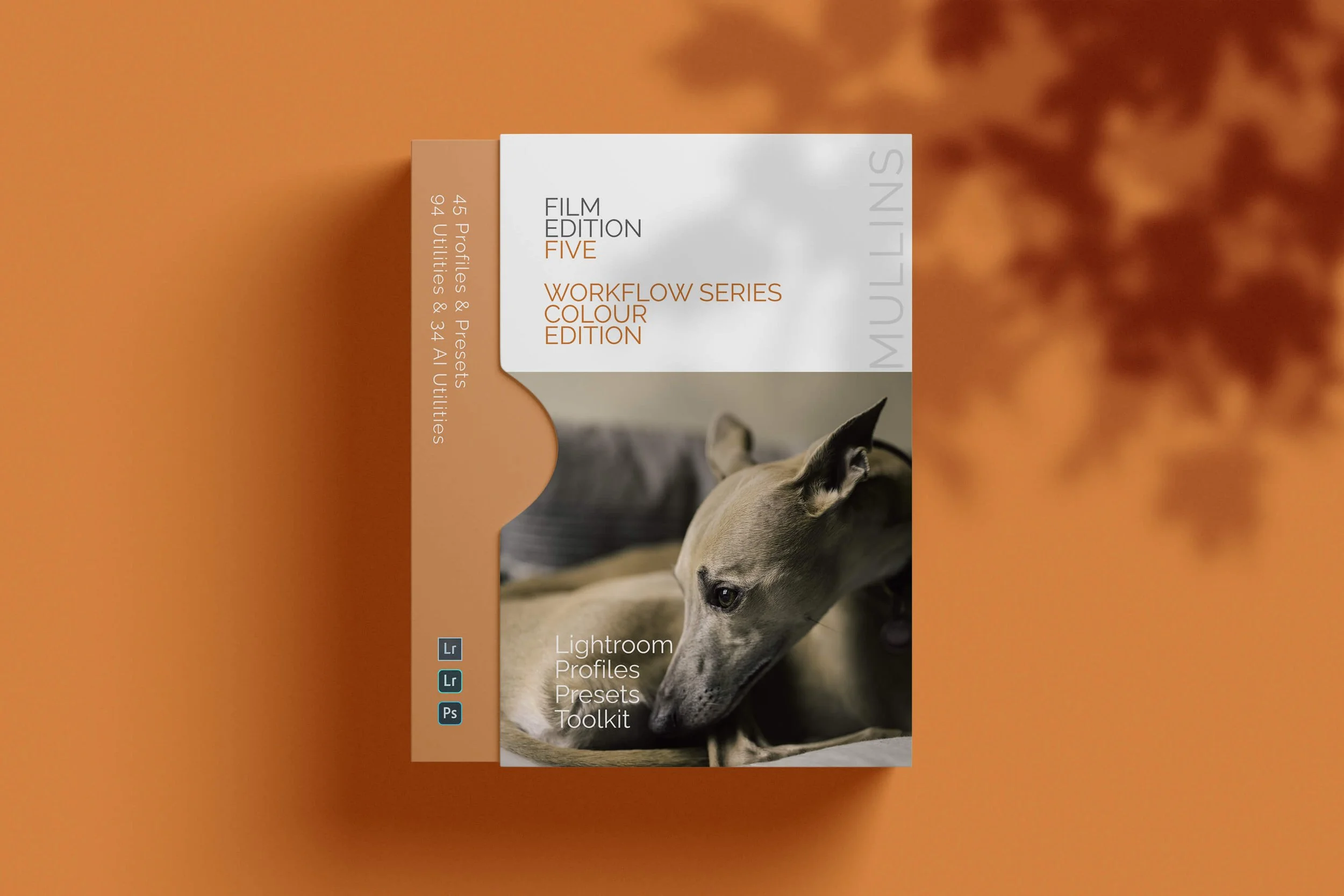
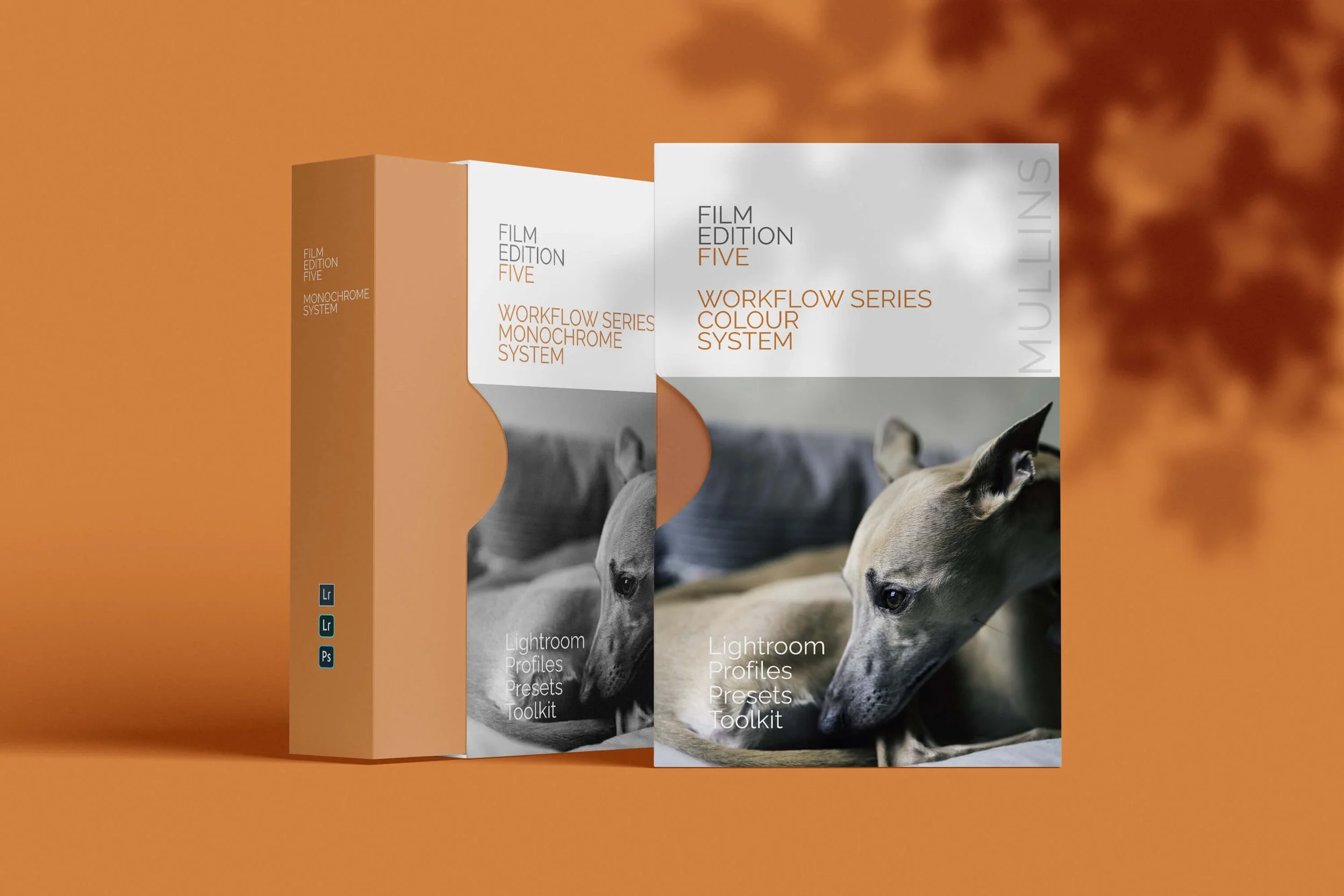
For those of you who prefer to shoot RAW and edit with the more advanced latitude this gives you, you may be interested in my current set of Professionally designed profile-based Lightroom and Adobe Camera Raw Presets.
50s Noir: More Sample Images



A complete black and white Profile, Preset & Workflow Pack for Lightroom
Film Edition 5 - Workflow Series (Monochrome) is a structured set of Lightroom profiles and presets designed to help you achieve a finished monochrome look quickly and consistently.
This is not a random “pick a look and hope” pack. It’s designed as a repeatable workflow you can run on a full set of images, with fixes and finishing tools when you need them.
If you edit regularly in Lightroom, you already know the problem. You want a strong black-and-white style, but you also need it to behave consistently across different scenes, lighting conditions, and subjects. This pack is designed to help you move fast without the work looking rushed.
You start with one of the custom monochrome profiles to establish the tonal foundation, then shape the image with workflow presets that are designed to work with that profile rather than fight against it. From there, you can use the included Toolkit for things like AI masking, grain, curves, highlight control, sharpening, finishing touches, and everyday problem-solving inside Lightroom. The product page positions the pack exactly this way, with the profile first, workflow second, then utilities and finishers to refine only when needed.
Built for speed and consistency
If you edit your photos in Lightroom, you already know the problem: you want a strong monochrome style, but you also need it to work across different scenes without constant fighting.
This pack helps you move fast without the work looking rushed.
Fast workflow: fewer decisions, clearer steps.
Consistent results: the set hangs together as a series.
Film-inspired tonality: depth, shape, and texture without the “preset look”.
Useful fixes included: real-world Lightroom problems, solved quickly.
What’s included
11 custom monochrome profiles
20 one-click presets
128 Mullins Lightroom Toolkit presets, including AI masks, fixes, utilities, grain, tone curves, colour helpers, sharpening and finishers
Compatibility
Works with Lightroom Classic and Lightroom Desktop. AI Mask presets require Lightroom Classic 11.0+ or Lightroom Desktop 5.0+.
Three for Two Offer
All preset packs are included in the 3-for-2 offer. Add any three preset packs to your basket, and the cheapest one is free at checkout.