Film Recipe - Newspaper - Film Base (Monochrome)
Newspaper Black and White Fujifilm Recipe
Newspaper Fujifilm Film Recipe
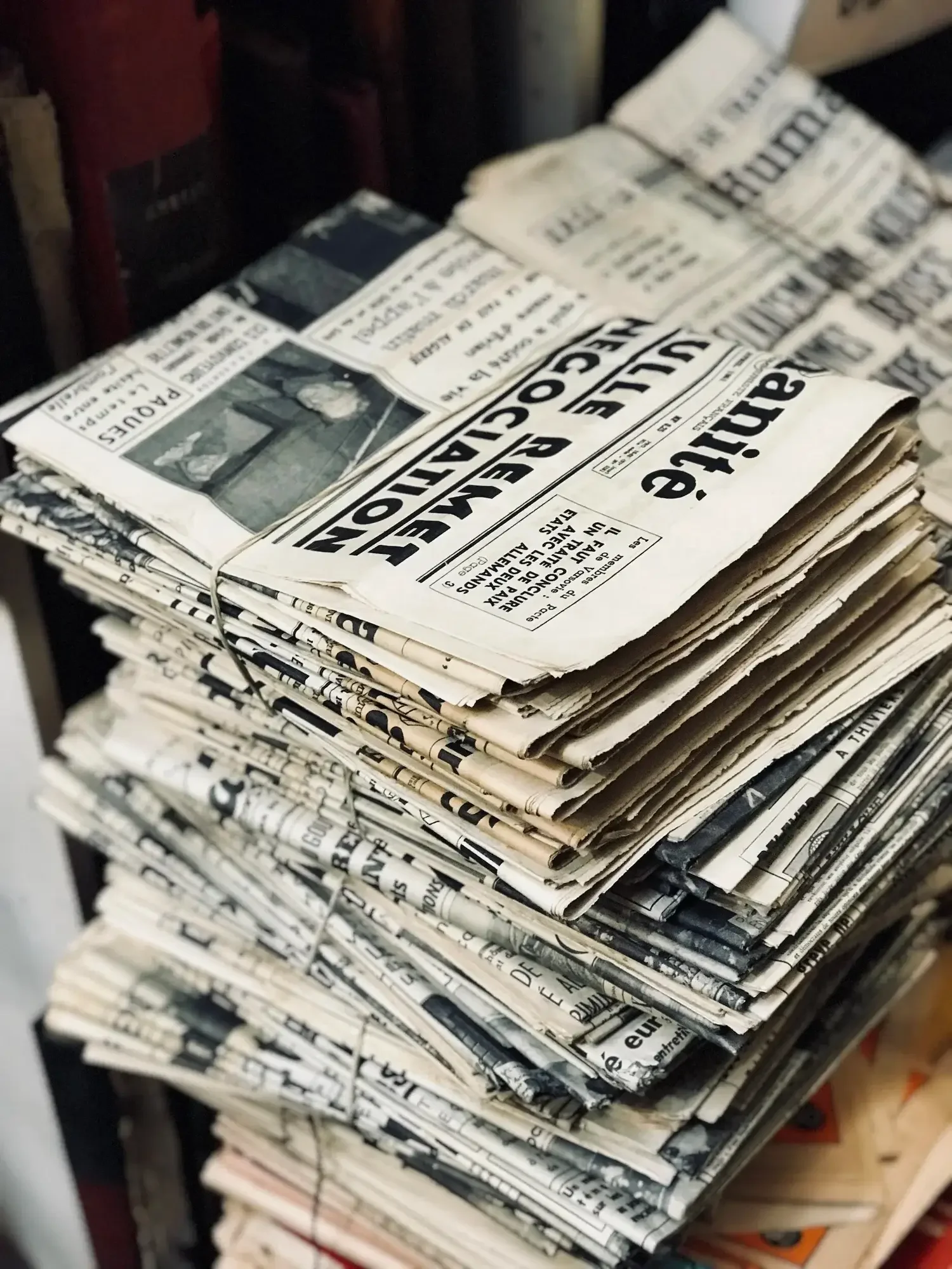
This recipe is a nod to the days when the world arrived in black and white, printed on cheap paper and dropped on doorsteps. Newspaper is inspired by the high-contrast, rough-textured look of black-and-white press photography from the 1970s and '80s—images made for impact, not subtlety.
Back then, the printing process forced everything through a halftone screen—tiny dots that stood in for smooth tones. It gave photos that gritty, almost broken-up texture. Highlights were often blown out, shadows collapsed, and yet… it worked. There’s a charm to it. A kind of urgency. These images weren’t perfect, but they were unforgettable.
This recipe channels that feeling. High contrast, pronounced grain, and a cool tone shift that pushes it just a little further from polished digital monochrome and closer to the imperfect beauty of the printed page.
Fujifilm JPEG Settings:
Film Simulation - Acros + YeGrain Effect - StrongGrain Size - SmallWB Shift - R:-4 B:-3Highlight Tone - +4Shadow Tone - +4Sharpness - +2Clarity - 0
NOTE: Some settings may not be available on every Fujifilm Camera
Notes on the Settings
ACROS+Ye brings a balanced monochrome base with just enough punch in the contrast. It works well with grain-heavy looks without becoming too aggressive.
Grain Effect: Strong / Small mimics the halftone texture you’d get from old newsprint. It doesn’t look exactly like ink on paper, of course, but it adds a tactile roughness that helps get you there.
White Balance Shift R:-4 / B:-3 cools the tones noticeably. This might surprise you at first—most recipes warm things up—but that slightly bluish cast works beautifully when you want something to feel detached, a little cold, even historical.
Highlight and Shadow Tone +4—both maxed out. This is what gives the image that sharp newspaper contrast. Bright areas blow out, darks drop away. It’s not about preserving detail—it’s about making a bold visual statement.
Sharpness +2 ensures edges stay crisp, especially when there’s a lot of grain and tonal compression.
Clarity 0 is intentional. Adding it here would modernise the look too much. Let the contrast and grain do the heavy lifting.
High ISO NR at 0 keeps it neutral. You could drop it to -2 or -4 if you want even more texture, but for this one, I’ve kept it clean-ish.
Creative Reasoning
Newspaper is perfect for storytelling in harsh light, street scenes with bold shadows, or even detail shots where texture and contrast carry the emotion. It flattens the image a little, but that’s part of the charm—it feels more like a page than a screen.
There’s a kind of honesty in the way it renders the world. Like a memory—not quite accurate, but full of character.
It’s not about perfection. It’s about impact.
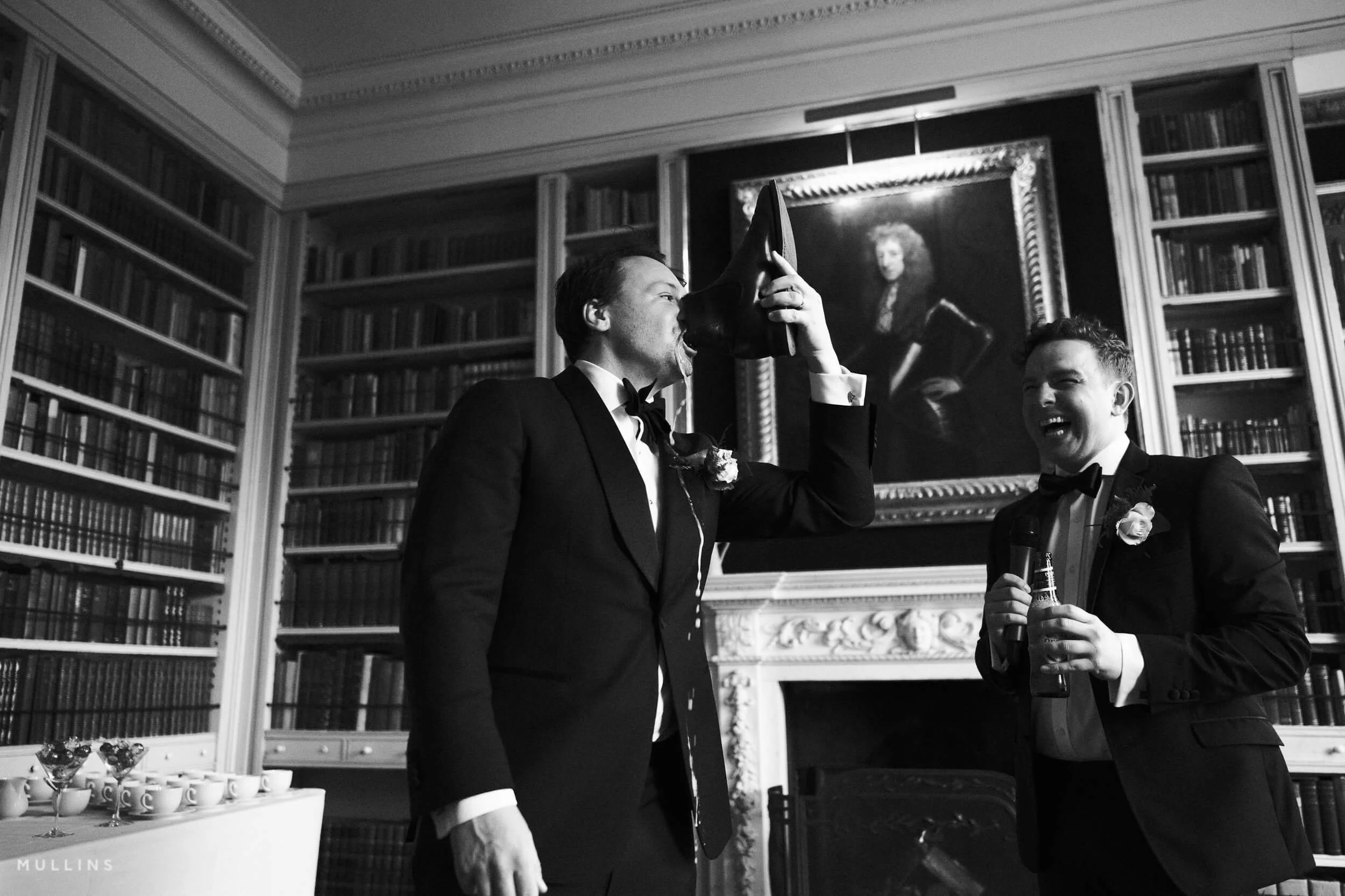
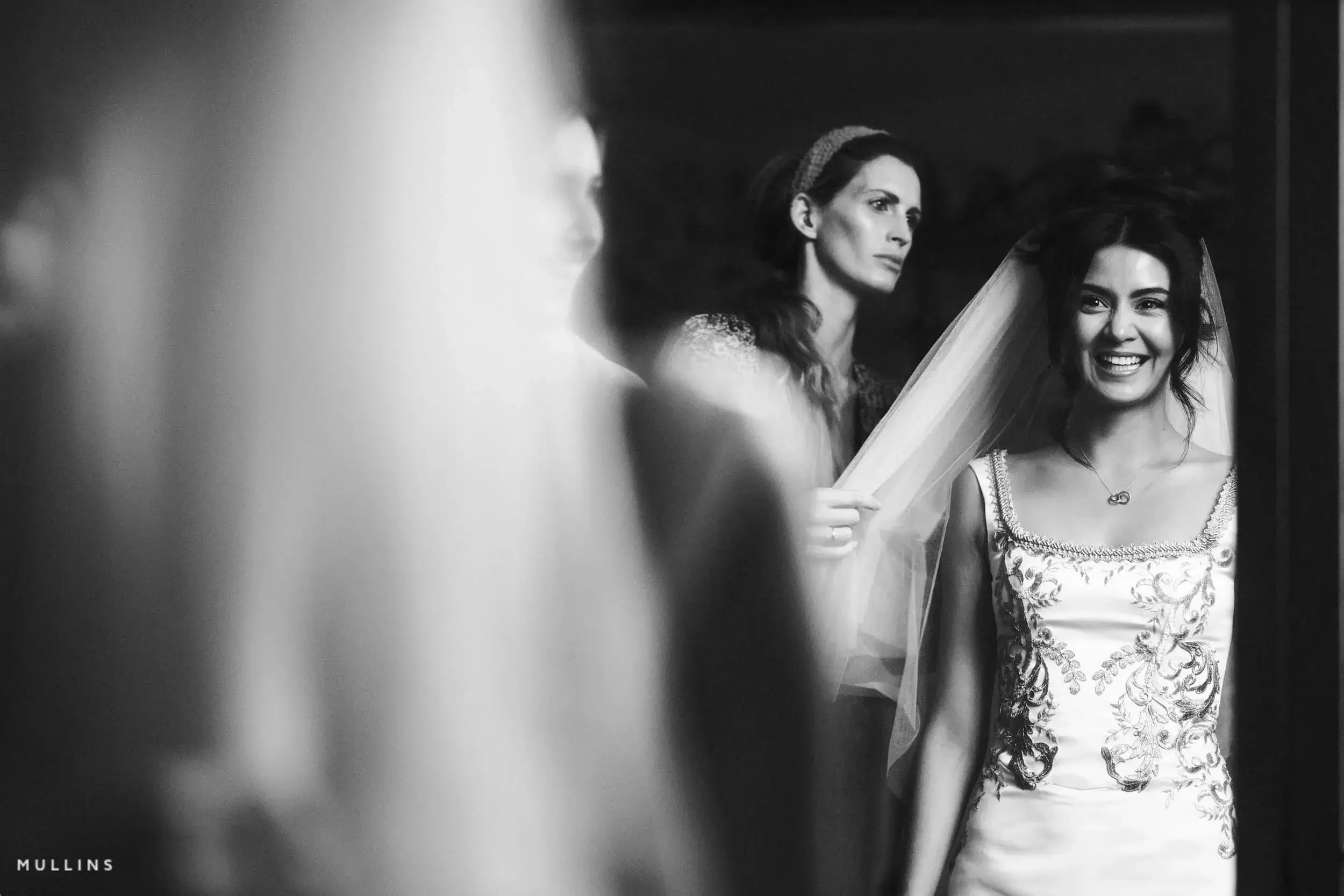
Newspaper: Black & White Film Simulation Recipe (Sample Images)


If you prefer Shooting RAW:
Those of you who prefer to shoot RAW and edit with the more advanced latitude this gives you may be interested in my current set of Professionally designed profile-based Lightroom and Adobe Camera Raw Presets.
Newspaper: More Sample Images