Film Recipe - Pan F (Monochrome)

Pan F Black and White Fujifilm Recipe
Pan F Black and White Fujifilm Recipe
This one is inspired by Ilford Pan F Plus—a film stock known for its stunning sharpness, incredibly fine grain, and punchy contrast. It’s a low-speed film, traditionally rated at ISO 50, which is part of why it was so clean. No grit, no mess—just crisp, precise tones. A lot of people used it for landscapes or architecture, but it could just as easily sing in the studio, given the right light.
There’s something elegant about it. Almost clinical, but not in a cold way. Just… precise.
This digital version aims to recreate that clarity and tight tonal control. It’s not gritty, and it doesn’t try to be. It leans more into resolution, light structure, and that beautiful balance between rich blacks and well-controlled highlights. If you want texture without noise, and sharpness without harshness, this is the one.
Fujifilm JPEG Settings:
Film Simulation - AcrosDynamic Range - DR200Grain Effect - WeakGrain Size - SmallMonochromatic Colour - WC:0 MG:0WB Shift - R:2 B:-1Highlight Tone - +1Shadow Tone - +2Sharpness - +3HIGH IS NR - -2Clarity - 0
Notes on the Settings
ACROS is the cleanest of Fujifilm’s black-and-white film sims—ideal for this kind of refined, high-resolution look. Unlike Acros+R or +Ye, it doesn’t lean into contrast artificially—it lets the tone curve breathe a bit more.
Grain Effect: Weak / Small is key. Pan F was known for having incredibly fine grain—almost invisible unless you went looking for it. This keeps things natural without adding digital texture where it’s not needed.
Dynamic Range DR200 helps protect highlights without completely flattening the image. Pan F had contrast, but it also clipped if you weren’t careful—this setting helps you ride that line digitally.
White Balance Shift R:+2 / B:-1 adds a very slight warmth. It’s enough to take the clinical edge off and make things feel a little more tactile, especially in skin tones or early morning light.
Highlight Tone +1 / Shadow Tone +2 builds the contrast in a controlled way. You still get shape and punch, but without going full noir. It mirrors Pan F’s tendency to lean dramatic—without going too far.
Sharpness +3 is higher than usual, but justified. This recipe is about clarity. If you’re photographing anything with texture or pattern—fabric, stone, foliage—it will come through clearly.
Noise Reduction -2 lets some natural character remain without smearing fine detail. Again, it’s about preserving the look of sharpness without introducing artefacts.
Clarity 0—and deliberately so. You don’t need it here. This one’s already sharp enough without pushing things into crunchiness. Leave it alone.
NOTE: Some settings may not be available on every Fujifilm Camera
Artistic Reasoning
PAN F works best when you want to see everything. The scene. The subject. The tiny details that normally get lost when things get too contrasty or too noisy. It’s especially good for architectural shots, landscapes in soft light, and portraits where the light’s clean and even.
You could absolutely use it as an everyday look—it’s flexible. But I think it shines most in situations where sharpness, structure, and subtle tones really matter.
It’s not dramatic in the obvious sense. But it is exact. And sometimes, that’s more powerful.
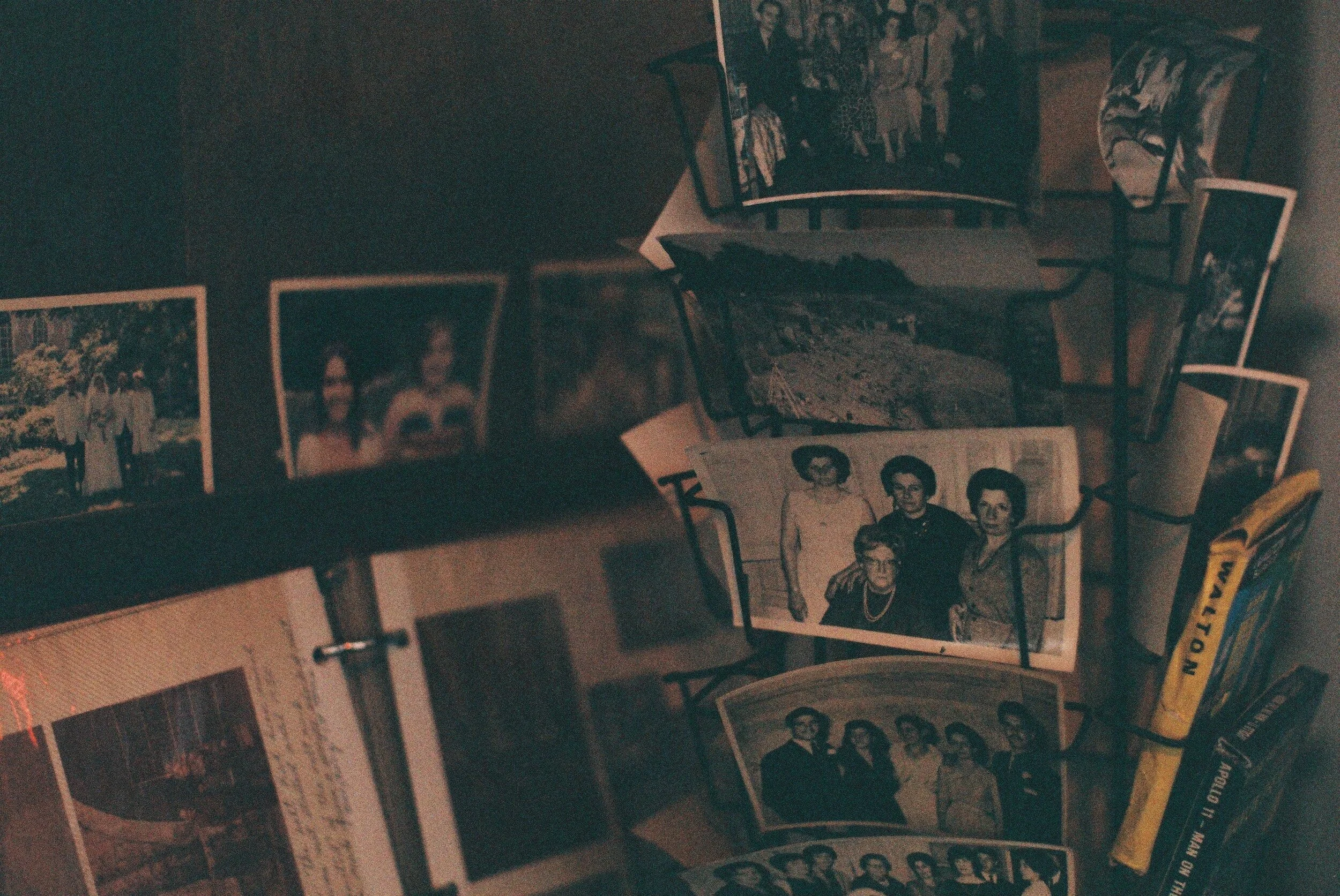
Pan F: Black & White Film Simulation Recipe (Sample Images)


If you prefer Shooting RAW:
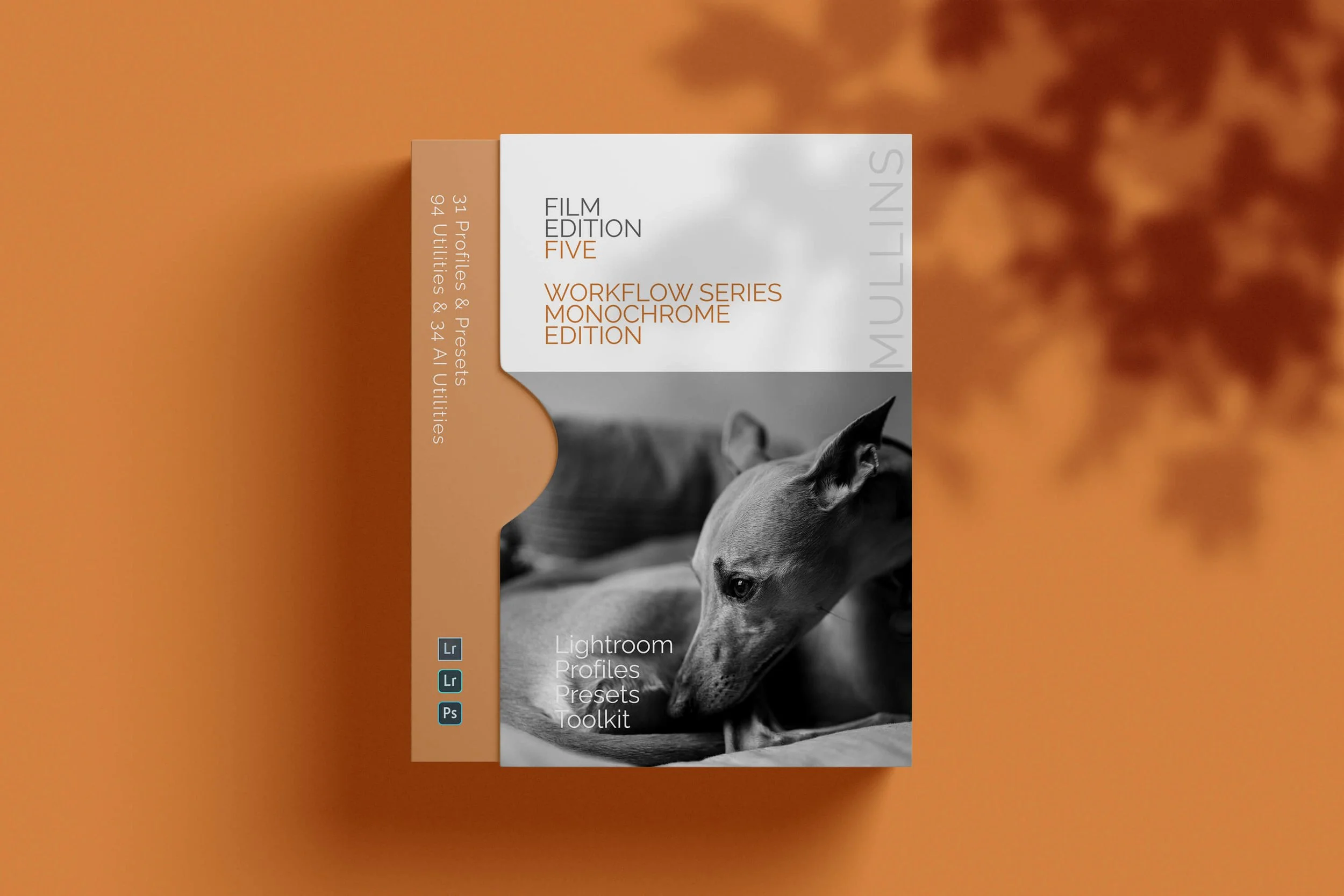
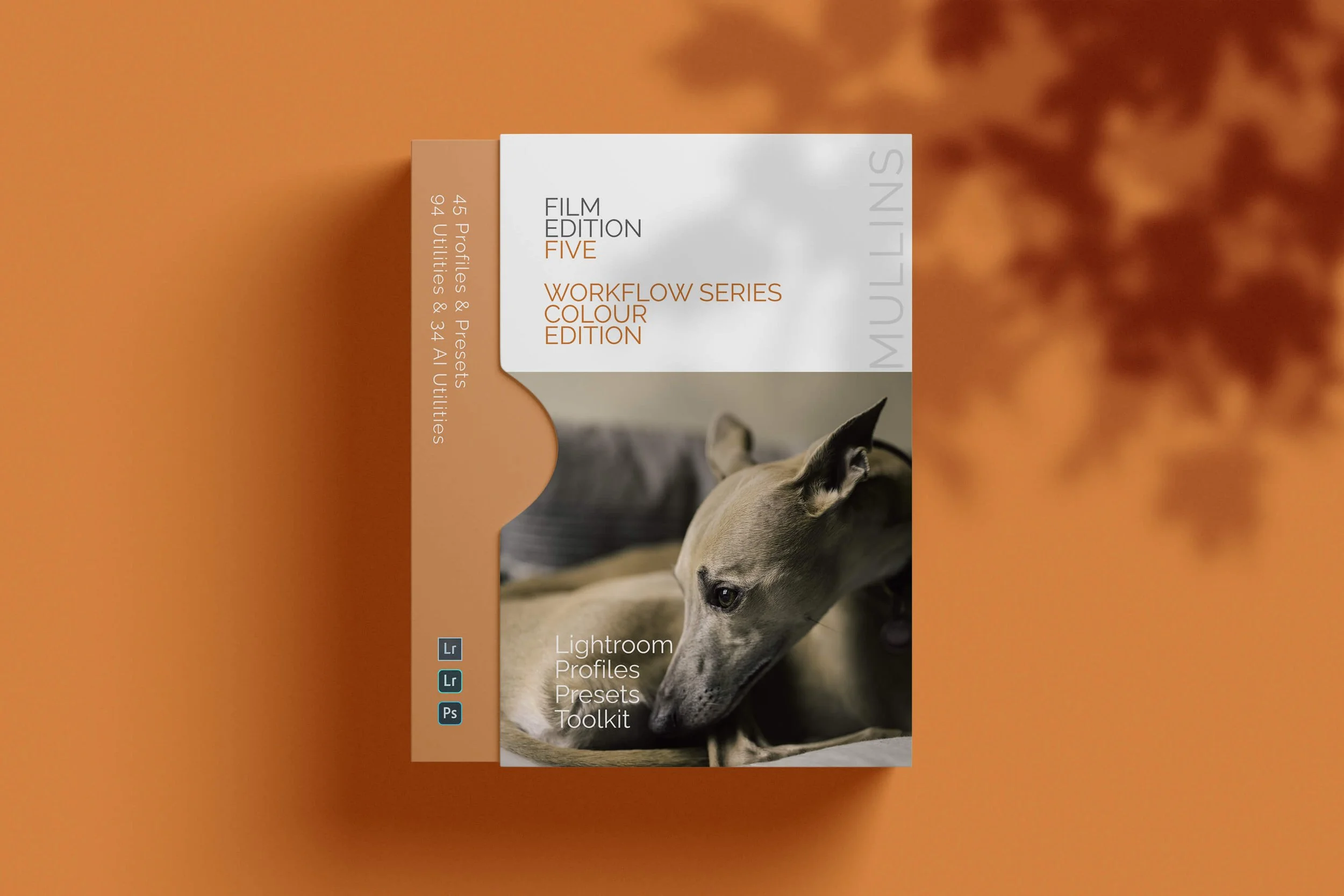
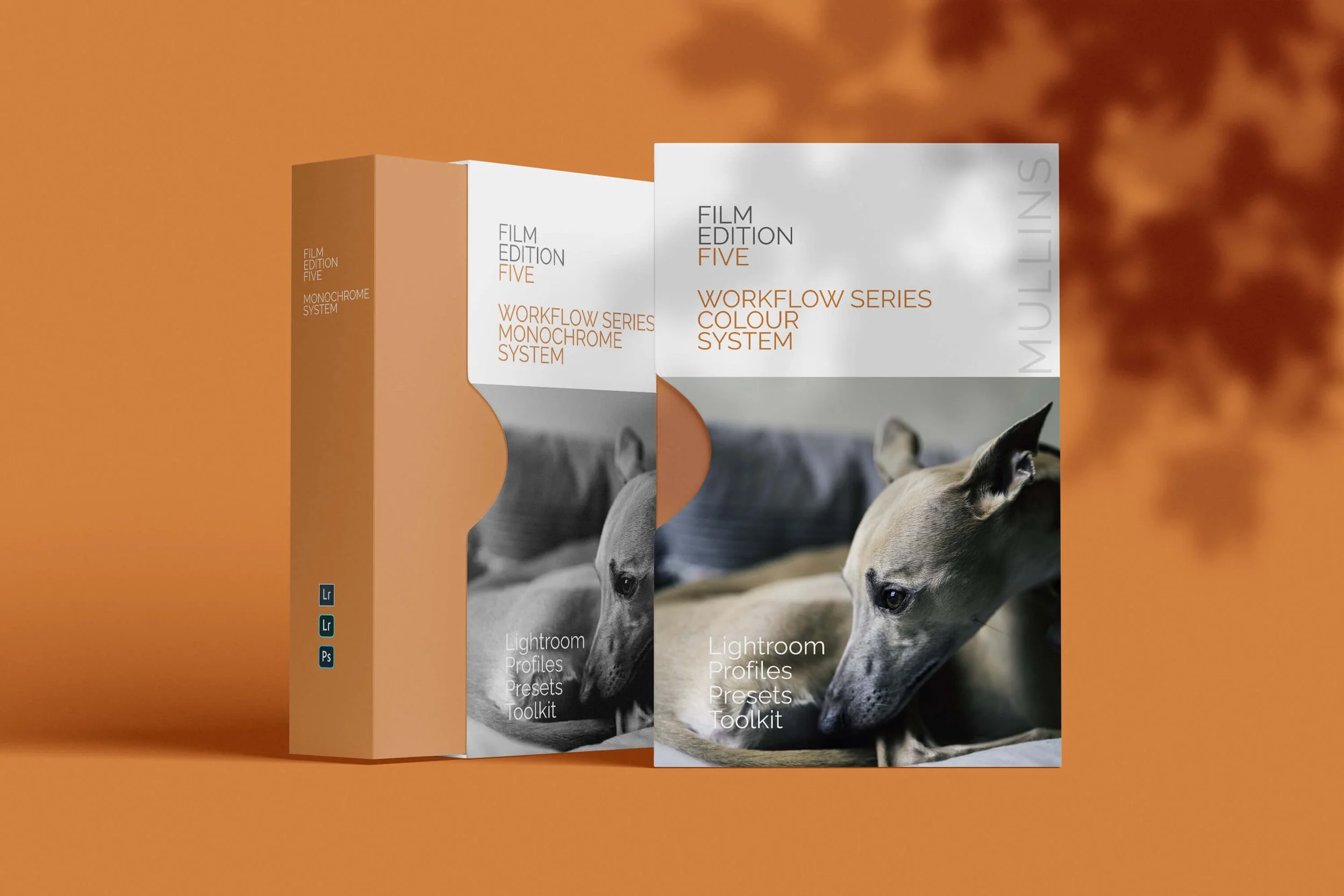
Those of you who prefer to shoot RAW and edit with the more advanced latitude this gives you may be interested in my current set of Professionally designed profile-based Lightroom and Adobe Camera Raw Presets.