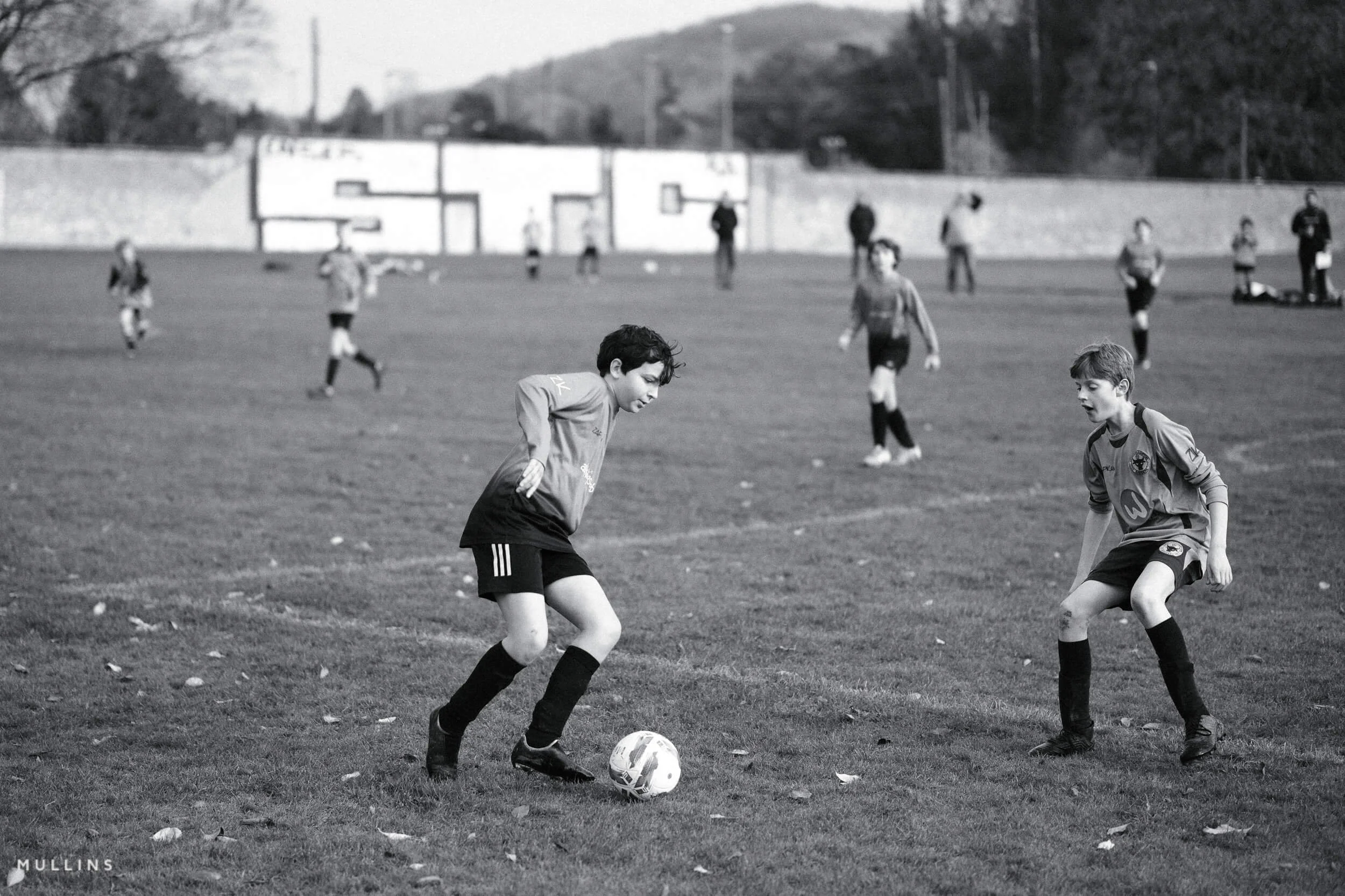
Film Recipe - HP4 (Monochrome)

HP4: Grainy Monochrome Film Simulation Recipe
Fujifilm Recipe HP4

This recipe is a quiet nod to Ilford’s classic black-and-white film stock—specifically HP4, part of the long-running Hypersensitive Panchromatic series that started back in the 1930s. HP4 came along in the 1960s and brought finer grain and better sensitivity than its predecessors. It had this beautifully balanced tonal curve—contrasty, but not harsh—and that’s what this digital version is trying to capture.
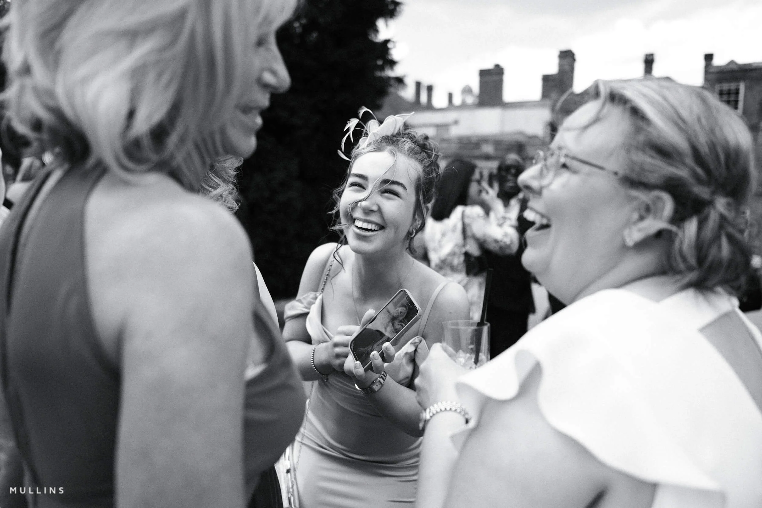
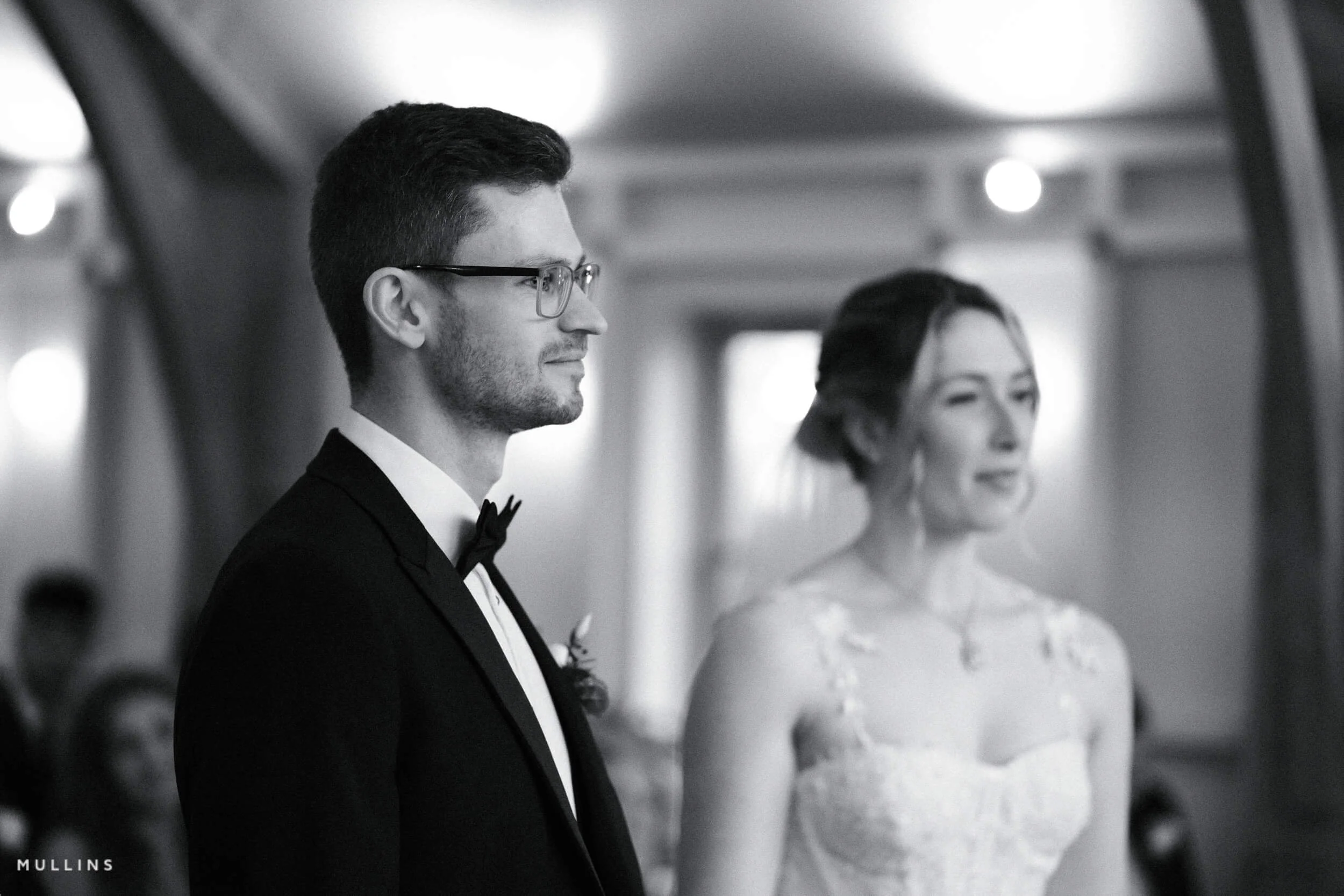
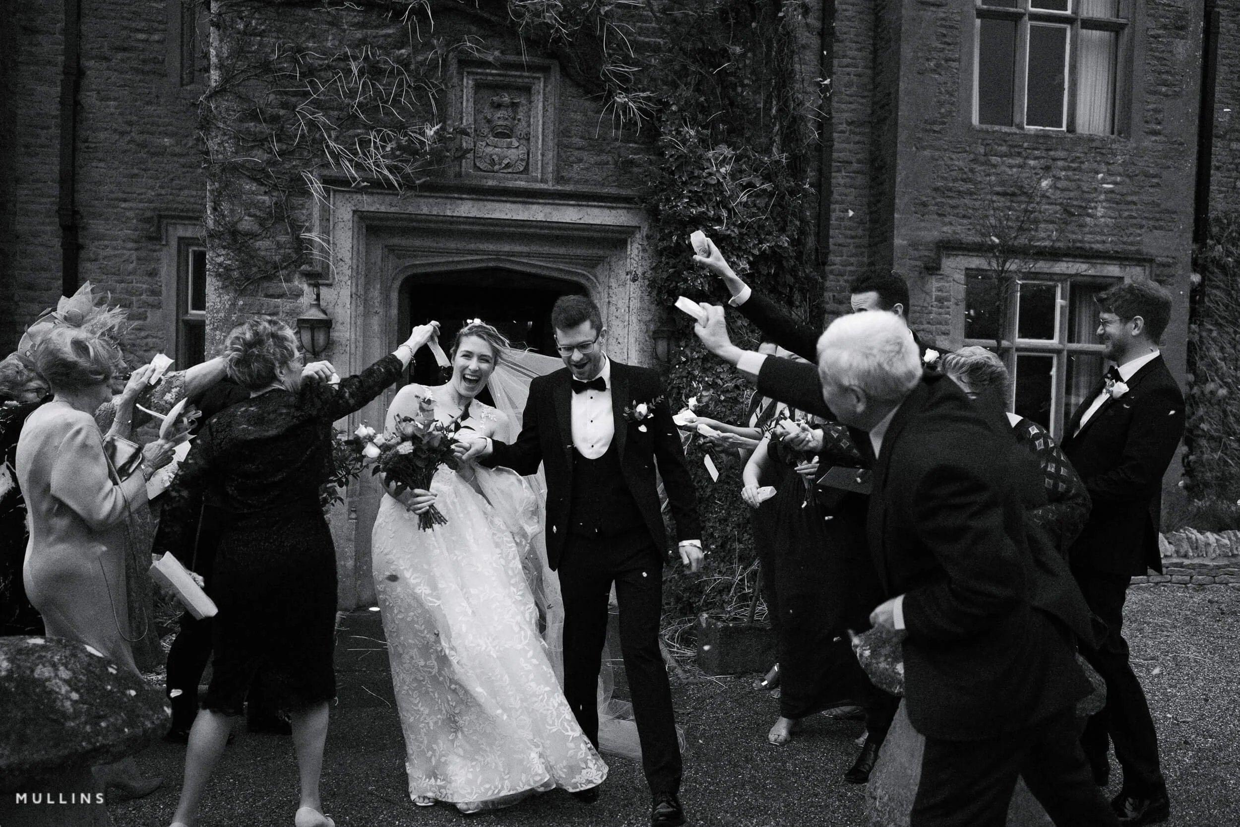
You could call this one a “daily documentary” recipe. It’s clean, punchy, and film-like without shouting about it. There’s grit, but it’s subtle. Detail, but not surgical. It works across a lot of situations—faces, buildings, trees, quiet interior scenes. It’s adaptable, which is probably why I find myself going back to it more than I expect.
It doesn’t try too hard. That’s part of its charm.
Fujifilm JPEG Settings:
Film Simulation - Acros + RGrain Effect - StrongGrain Size - LargeMonochromatic Colour - WC:-1 MG:0WB Shift - R:3 B:-2Highlight Tone - +2Shadow Tone - +2Sharpness - +1NR - -1
NOTE: Some settings may not be available on every Fujifilm Camera
Notes on the Settings
ACROS+R gives this recipe its backbone. The red filter deepens skies and gives skin a little more bite, which is helpful when you want the image to feel solid and grounded.
Grain Effect: Strong / Large leans into the film look. It’s not overwhelming, but it’s definitely present. Especially useful when shooting at higher ISOs or in flat light—you still get texture, even when contrast is low.
White Balance Shift R:+3 / B:-2 adds a touch of warmth while gently cooling off any blues. It’s subtle, but gives the images a bit of life—avoids that overly sterile monochrome feel.
Highlight and Shadow Tone at +2 each creates balanced contrast. It adds depth without crushing the blacks or blowing out the whites. It’s a kind of quiet contrast—decisive, but not aggressive.
Sharpness +1 helps maintain edge detail, especially around subjects with strong lines—windows, faces, trees. It’s enough to keep the image feeling crisp, but never clinical.
Noise Reduction -1 softens the digital side of things slightly, without stripping away the grain or making everything too smooth.
Clarity 0—and that’s deliberate. This one isn’t about edge contrast or extra punch. It’s about balance. You could try adding clarity later in post if you need it, but in-camera, it’s better left alone.
Artistic Reasoning
HP4 is a workhorse. It handles soft light, harsh light, overcast days, strong sun—it’s flexible. I tend to use it when I don’t want to overthink the scene too much. It just works. Especially when I’m shooting candidly and need the tones to carry the weight of the image, rather than any one dramatic element.
It’s not loud. It doesn’t ask for attention. But when you look back through your images later, it’s often the one that sticks. The one that quietly got it right.
HP4: Grainy Monochrome Film Simulation Recipe Film Simulation Recipe (Sample Images)


If you prefer Shooting RAW:
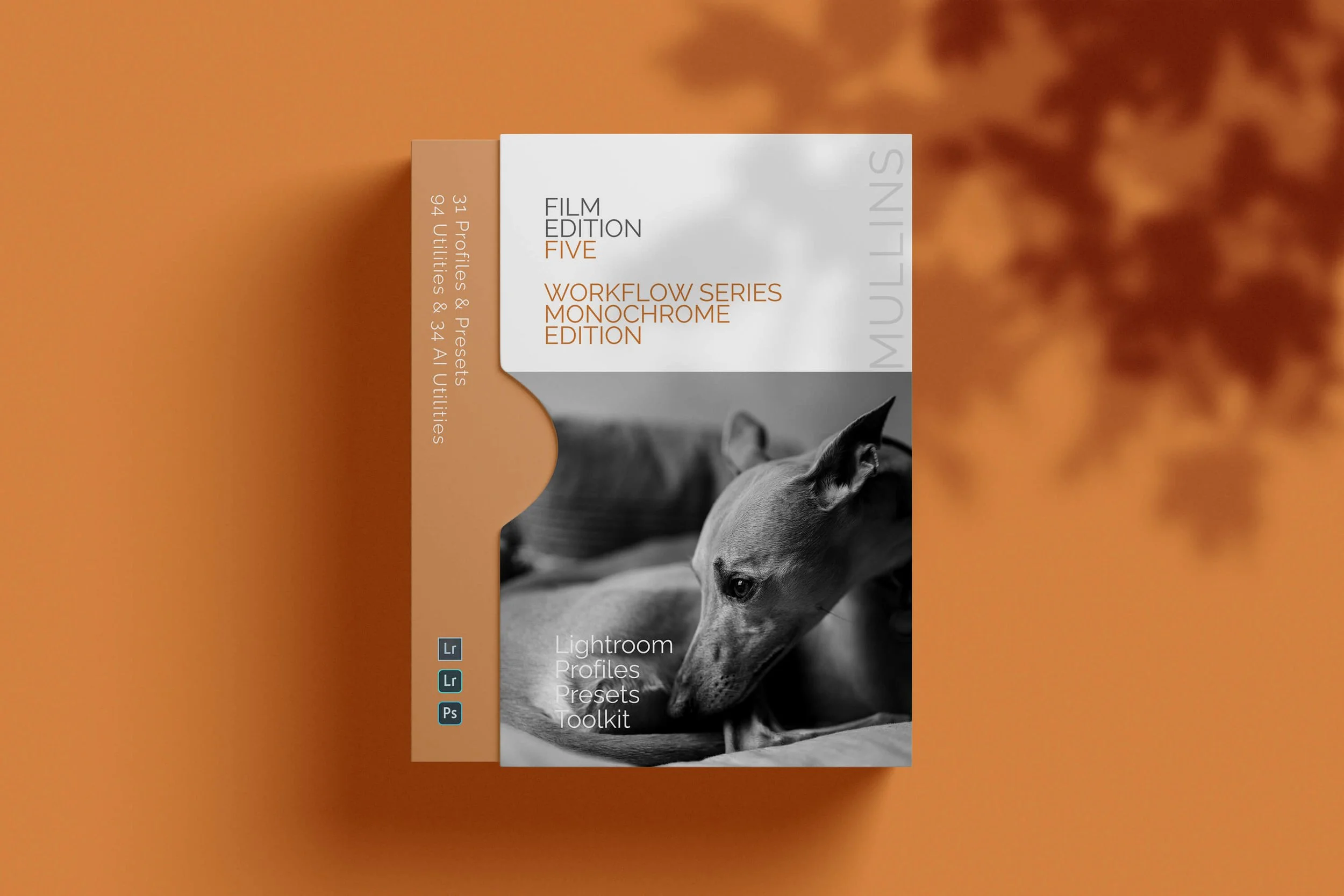
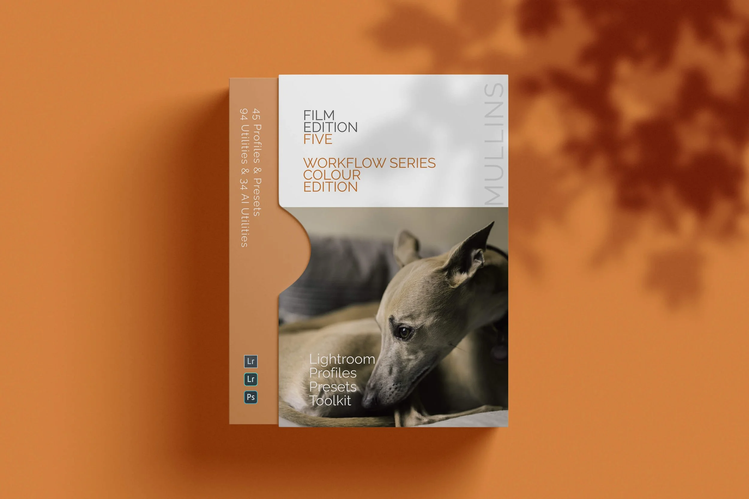
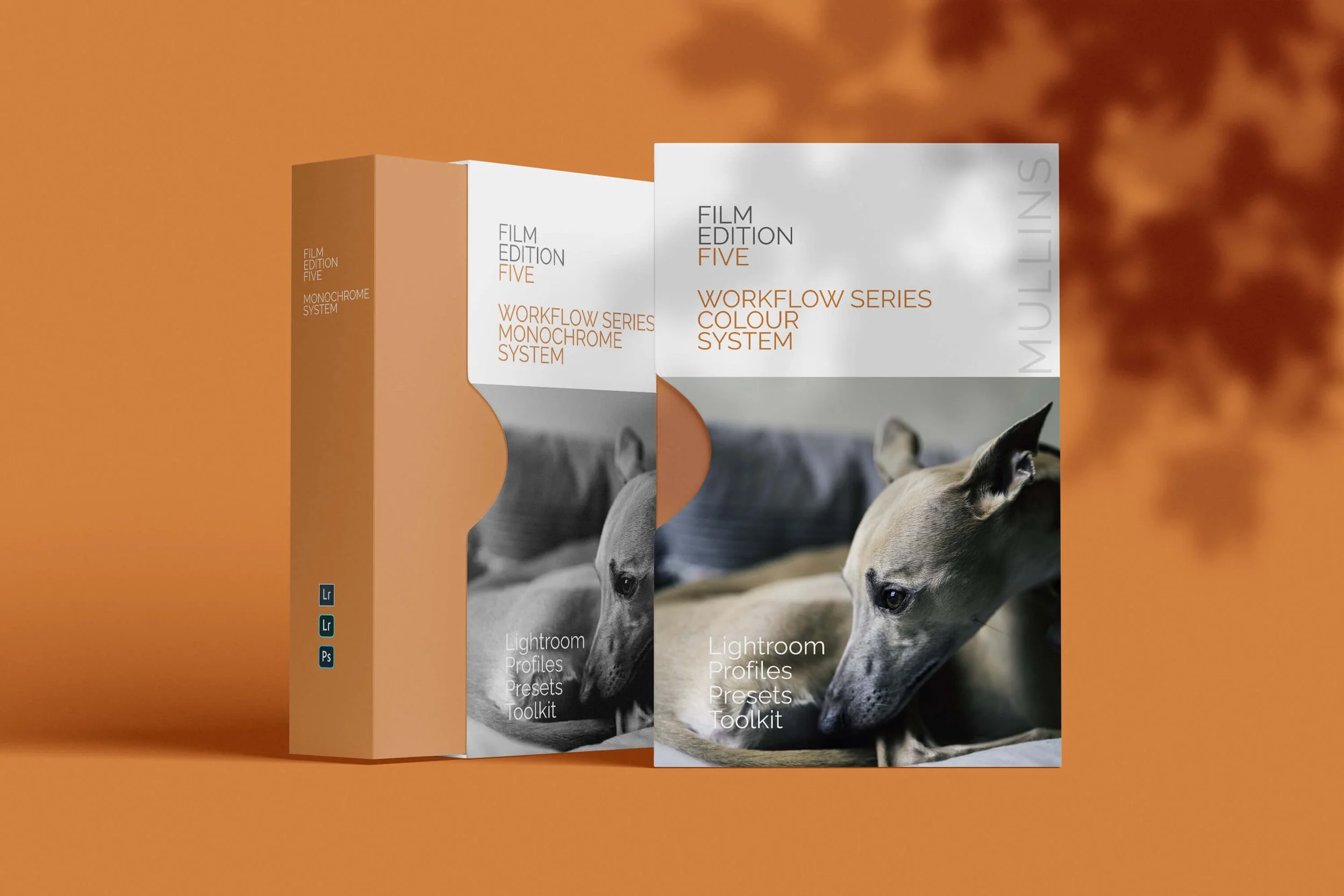
Those of you who prefer to shoot RAW and edit with the more advanced latitude this gives you may be interested in my current set of Professionally designed profile-based Lightroom and Adobe Camera Raw Presets.