Film Recipe - Cinematic Monochrome (Mono+Ye)

Cinematic Monochrome: Monochrome Film Simulation Recipe
Cinematic Monochrome
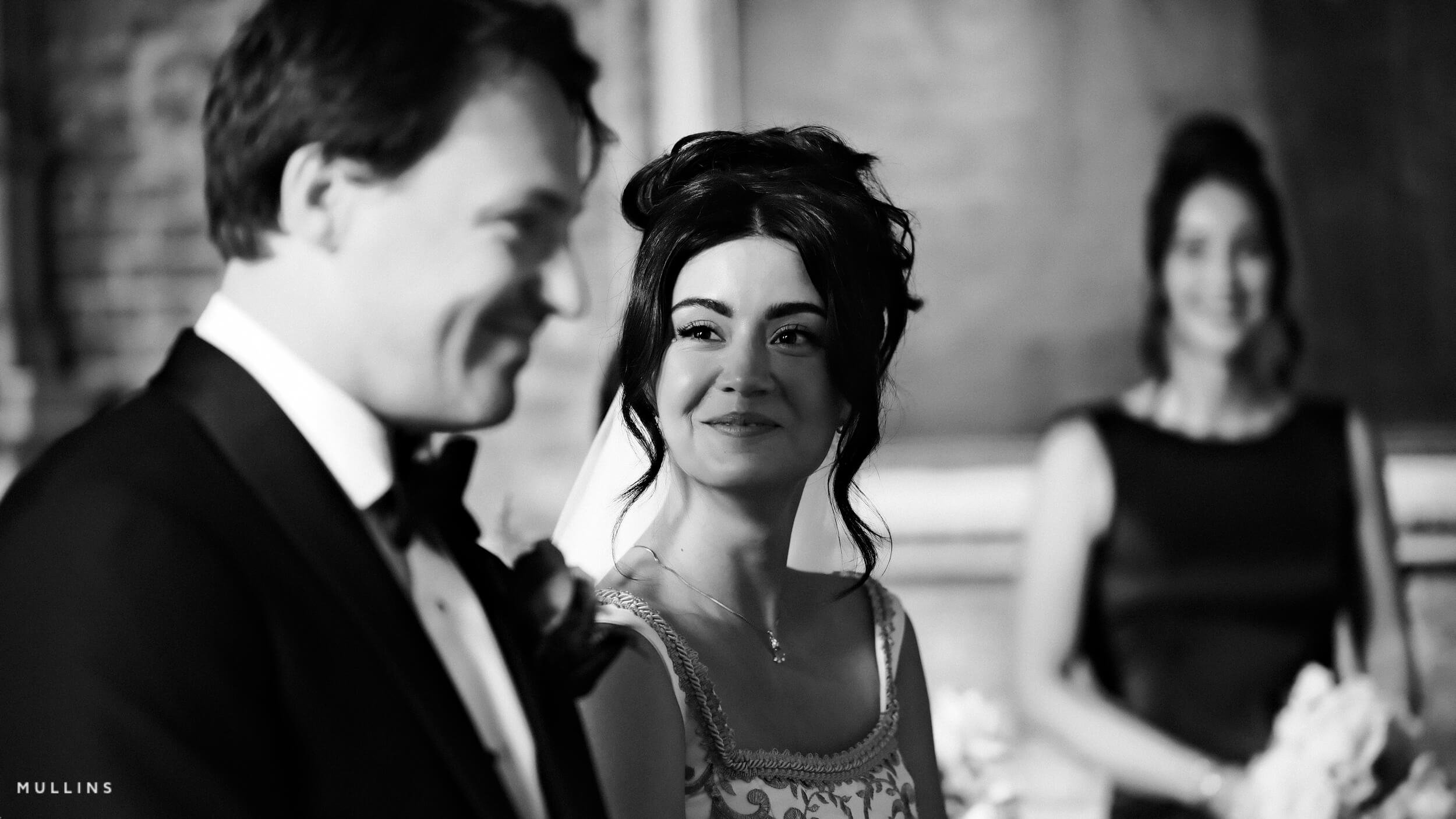
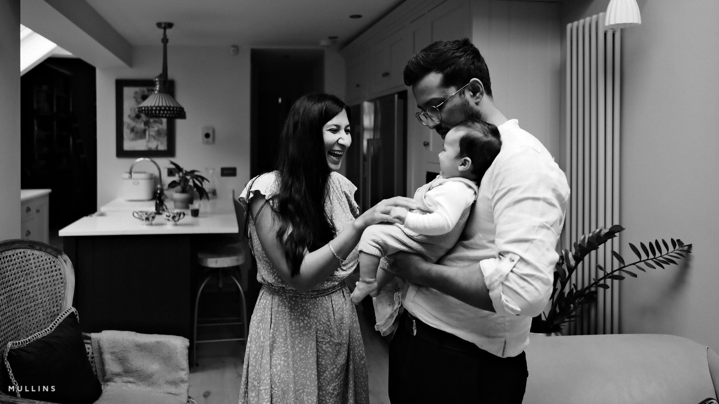
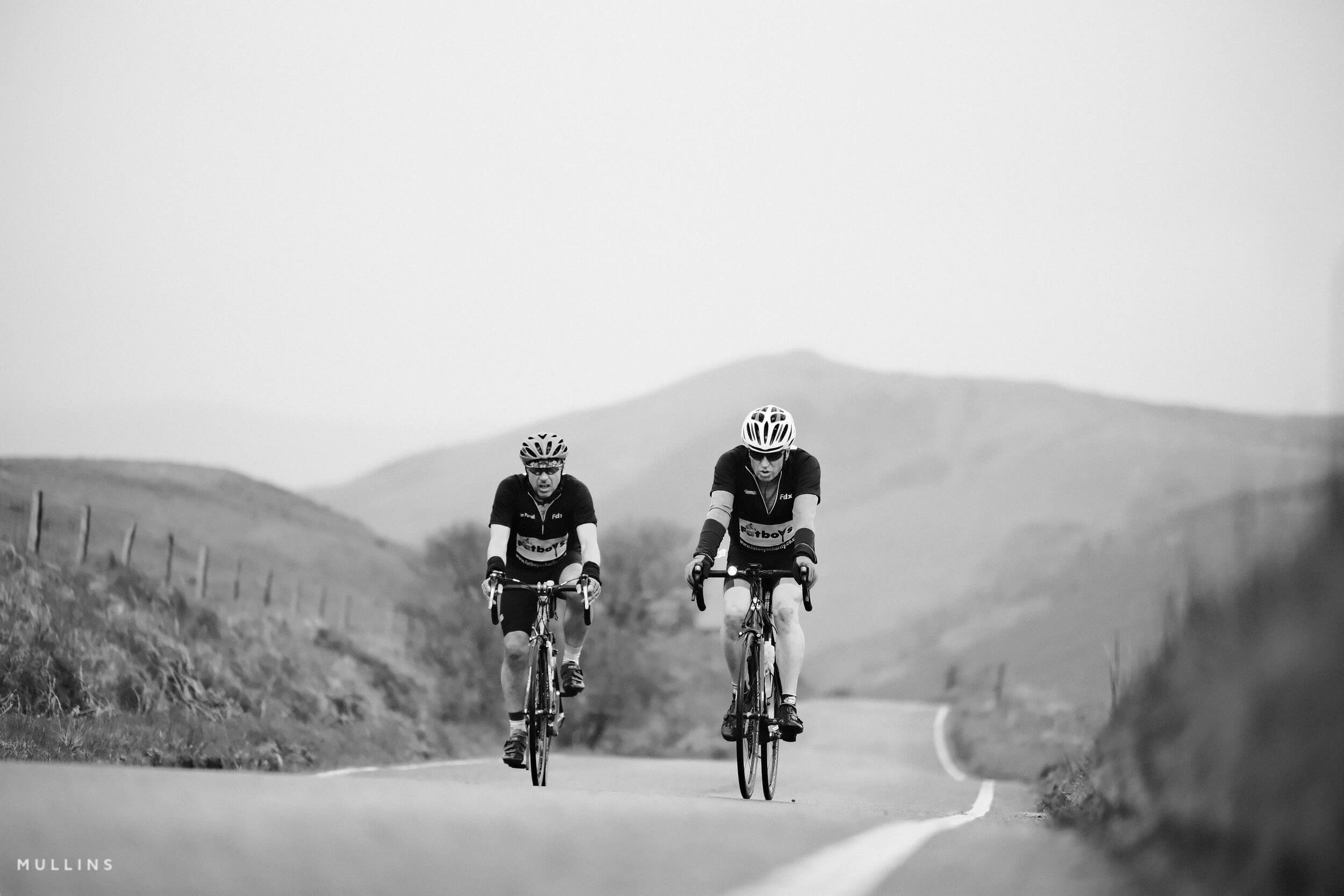
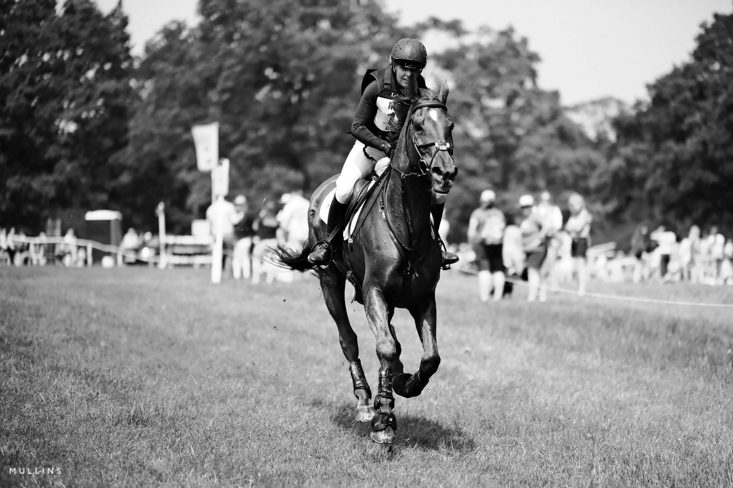
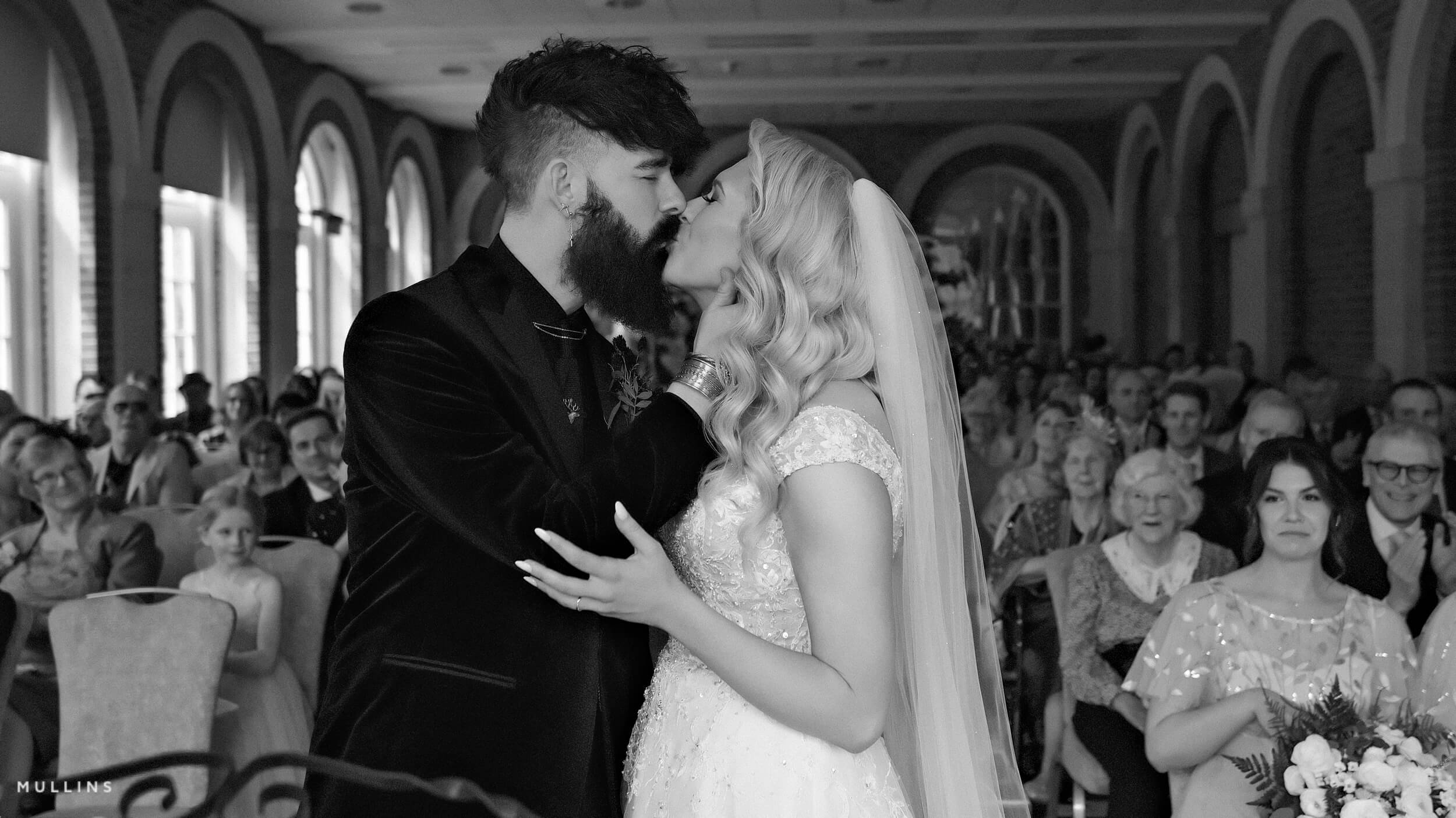
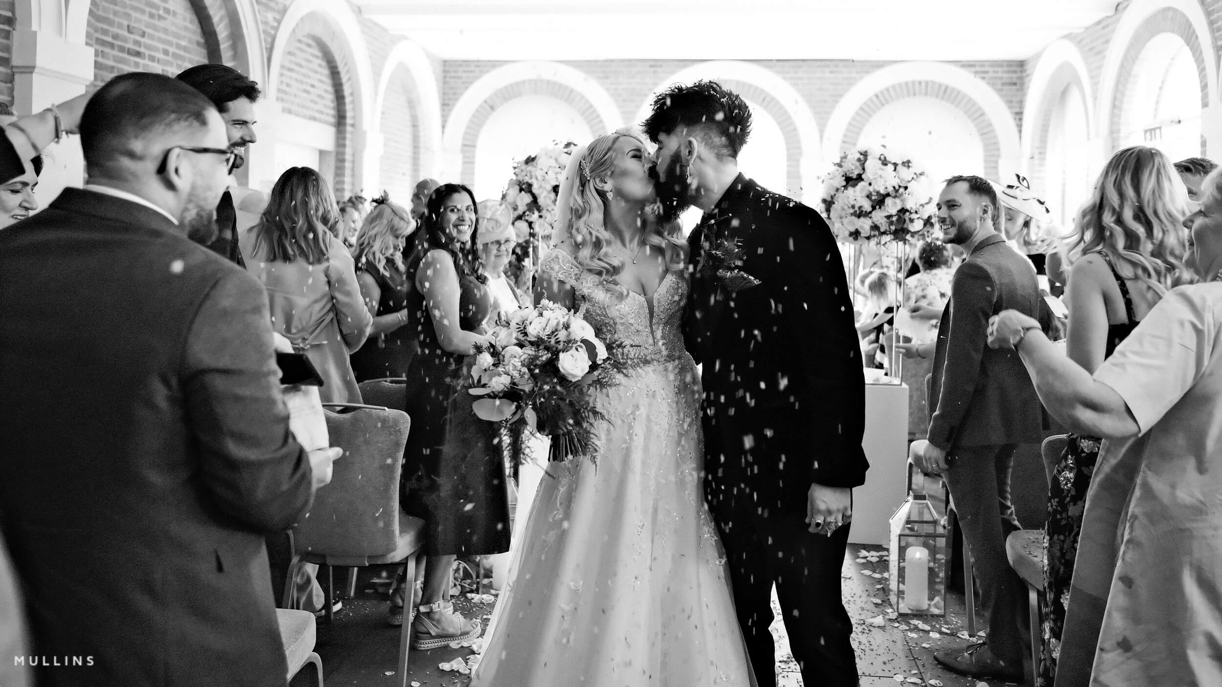
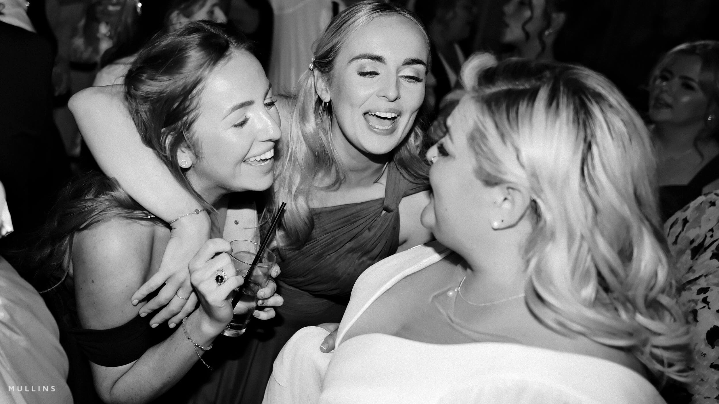
This one’s all about atmosphere. Cinematic Monochrome is built to echo the look and feel of old film reels—the kind of black-and-white you’d find in mid-century cinema: rich contrast, soft grain, and that unmistakable warmth you didn’t realise you missed until it showed up again.
It’s not trying to be gritty. It’s more refined than that. Smooth but not sterile. Dramatic, but not over the top. The warmth in the white balance gives it a gentle nostalgia, while the clarity and deeper shadows hold onto that sense of weight and presence.
I’ve used this recipe in a wide mix of situations—urban portraits, quiet corners of the city, even early morning light across open landscapes. It handles mood well. It doesn’t push as hard as something like Lighthouse or Pure Grit—it lets the tone build slowly instead

Fujifilm JPEG Settings:
Film Simulation: Mono+Ye
Grain Effect: Weak/Large
White Balance Shift: R:+9 B:-1
Highlights: +1
Shadows: +3
Sharpness: +1
Noise Reduction: -1
Clarity: +3
Settings Explanation:
MONO+Ye is a slightly different take on Fujifilm’s monochrome look—less punch than Acros, but more flexible. It’s smooth, clean, and still has bite when paired with the right shadow and clarity levels.
Grain Effect: Weak / Large adds texture without calling attention to itself. It’s enough to nod to film, but not so strong that it feels forced.
White Balance Shift: R:+9 / B:-1 warms the image noticeably. It adds a richness—almost sepia in some lighting—which helps give the whole frame a more cinematic presence. It feels less clinical. More inviting.
Highlights +1 brings some light into the frame without risking harshness. It opens things up a little.
Shadows +3 gives you that depth and mood. It’s a strong setting, but it works here. Helps anchor the look.
Sharpness +1 ensures you don’t lose the details in fabric, textures, or eyes—small things that matter in monochrome.
Noise Reduction -1 is a bit of a middle ground. It takes the edge off digital noise but still allows grain and texture to hold.
Clarity +3 is the defining feature here. It builds midtone contrast and gives surfaces a subtle presence—especially skin and stone or weathered wood. Be aware: it will slow your shot-to-shot time down. You’ll notice it.
Artistic Reasoning:
Cinematic Monochrome is ideal when you want elegance and drama to sit side by side. It works beautifully for portraits, especially in directional or natural light. But I’ve also used it on long walks through town, photographing quiet shopfronts or still alleyways. It makes everything feel like a scene from something slightly larger than itself.
It’s not flashy, and it’s not stark. It leans into mood, texture, and softness—but not at the expense of clarity. It’s about restraint.
Use it when you want your photos to feel like part of a longer story. Something already in motion, or already passed.
NOTE: Some settings may not be available on every Fujifilm Camera
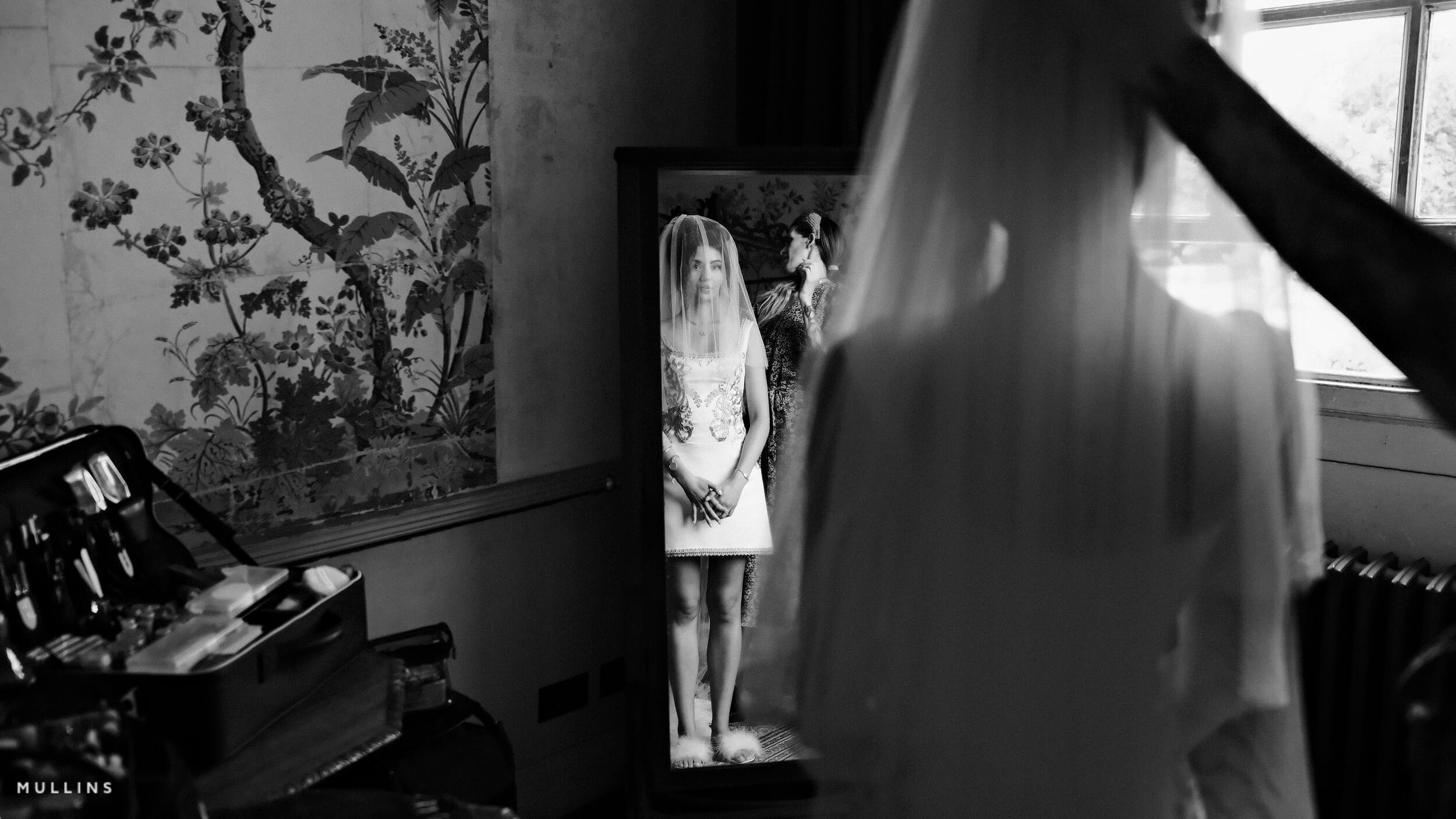
Cinematic Monochrome: Monochrome Film Simulation Recipe Film Simulation Recipe (Sample Images)


If you prefer Shooting RAW:
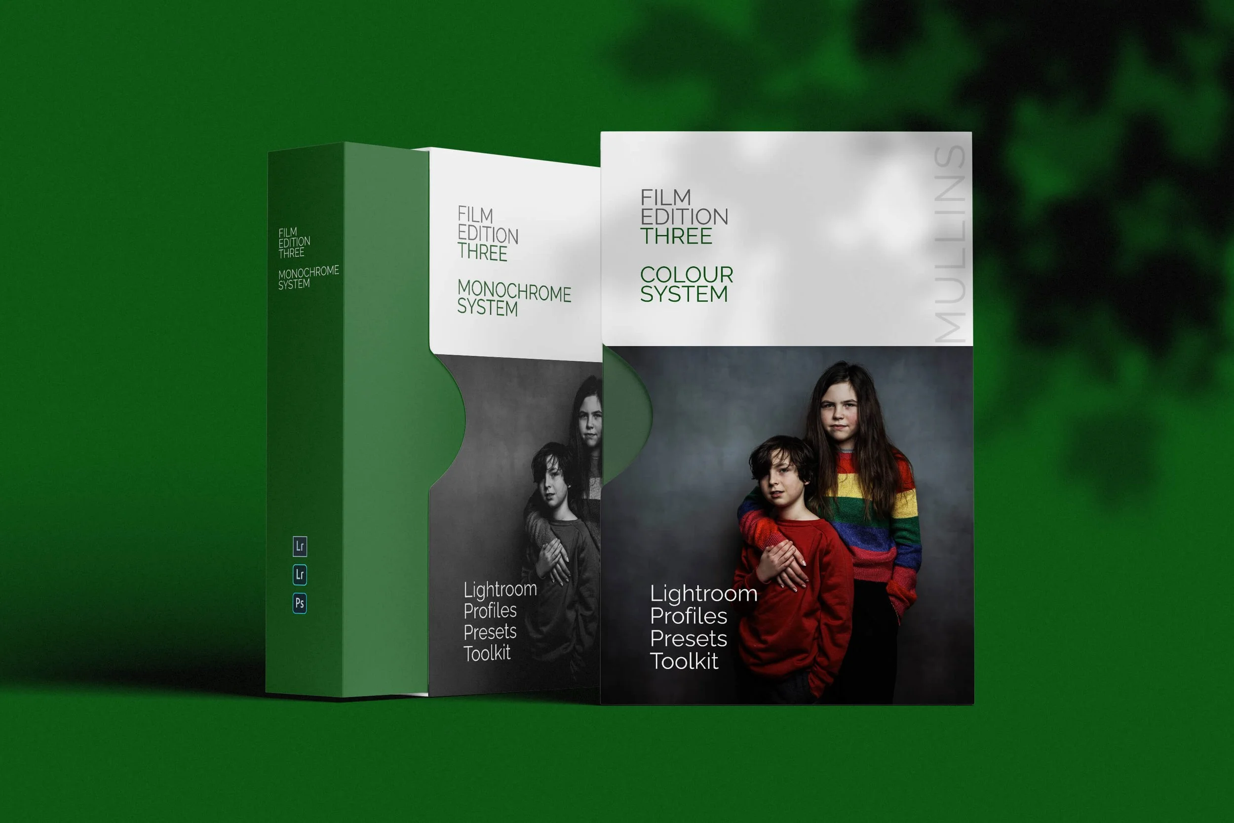
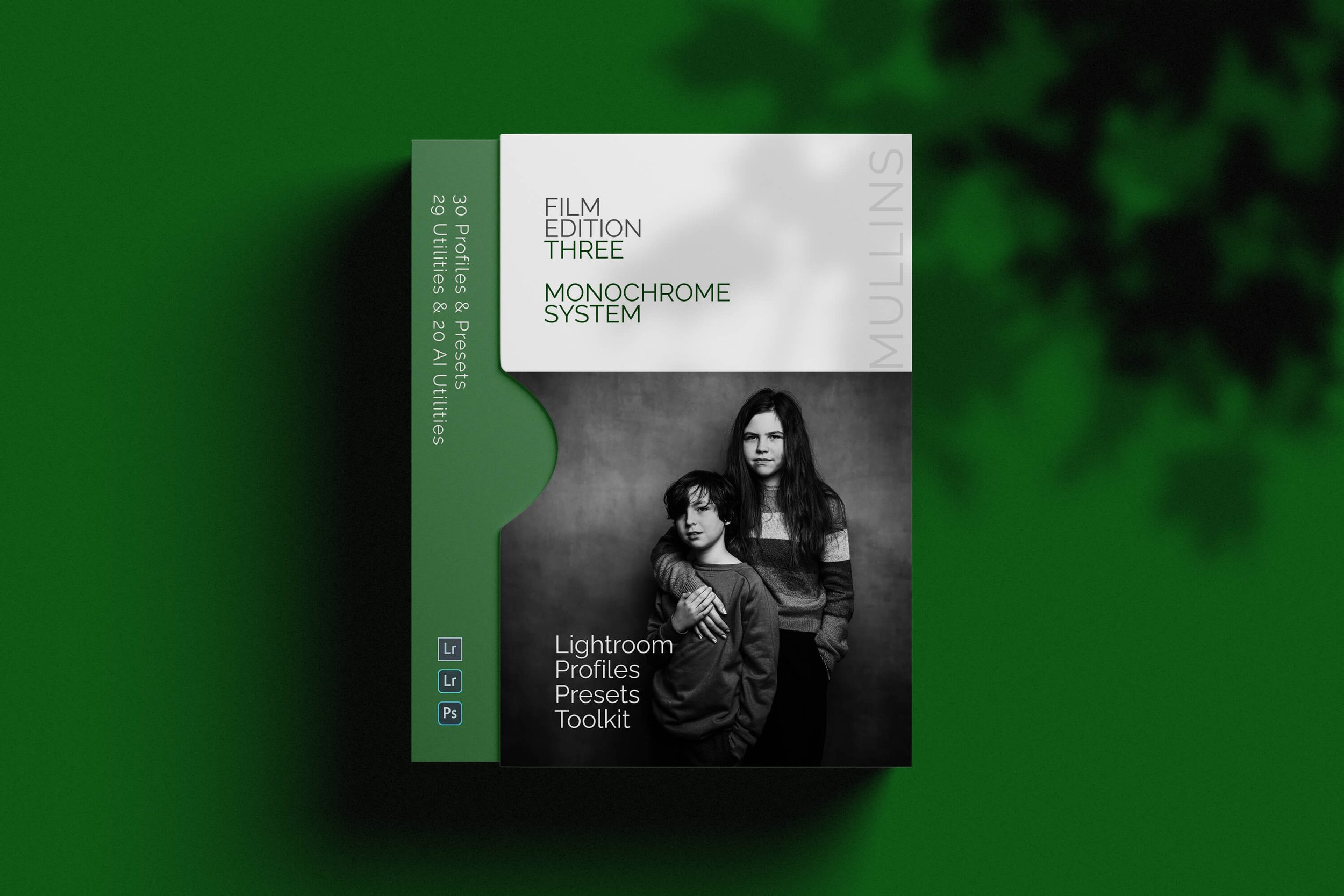
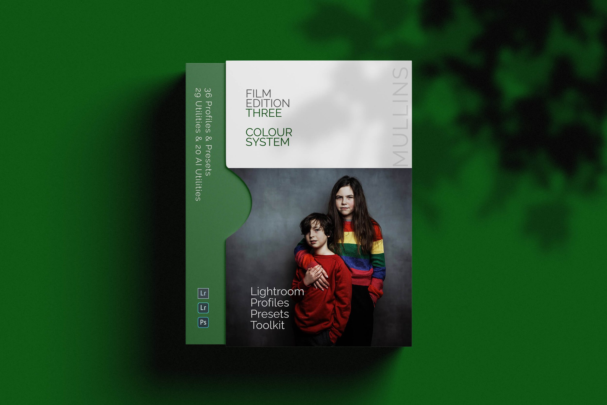
Those of you who prefer to shoot RAW and edit with the more advanced latitude this gives you may be interested in my current set of Professionally designed profile-based Lightroom and Adobe Camera Raw Presets.